Last Updated on 12.01.2026 by Vasyl Holiney
Marketers often focus on the email body and subject line, but email signatures are equally important. They serve as an epilogue, leaving a lasting impression. Signatures provide communication options and help achieve business goals, making them essential. But let’s start by explaining what a business email signature is.
Contents
- What is an email signature?
- Why do you need email signature marketing?
- How to create an effective email signature in 4 steps
- 7 marketing best practices for your email signature to work
- Create a professional email signature that converts
What is an email signature?
An email signature, or email footer, is the final element of your email campaign. It usually includes your company’s basic details, contact information, and logo – but you could enrich it with more contact details like an announcement or a link to your calendar. Brands should consider it an integral part of their identity, as it helps email recipients recognize and remember your business.
Why do you need email signature marketing?
People tend to remember the last piece of information they read. That’s why your email sign-off should make an impact. Need more reasons? Here’s why your business needs to invest in email signature marketing campaign as part of a well defined Marketing Roadmap that ensures every touchpoint supports your growth goals:
- Low cost advertisement: With the right signature, you reduce marketing costs while increasing lead generation by 18.8%. All you have to do is optimize it and keep sending targeted emails.
- Higher engagement: Your email footer could prompt recipients to take specific actions. For example, you could drive traffic by including a link to your blog or increase your response rates by encouraging subscribers to give you feedback.
- Strong brand identity: With a branded signature, you enhance your brand identity in every email you send. Also, you verify your credibility by confirming your company’s contact information or highlighting significant achievements.
How to create an effective email signature in 4 steps
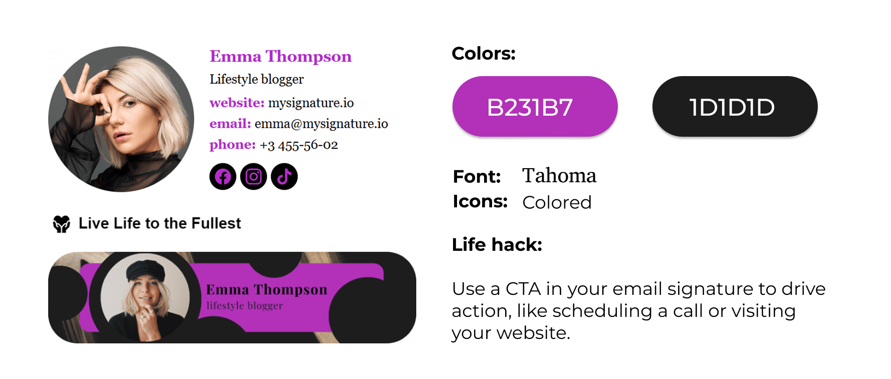
Before diving into signature best practices, let’s walk through the basic steps of creating an effective email signature:
1. Pick the right email signature management software
Most inbox service providers like Gmail, Outlook or Apple Mail give you the option to edit your email footer. If you want a professional email signature, though, you shouldn’t put limitations on your creativity. Instead, invest in powerful email signature software that helps you streamline your signature-creation process. For Gmail users, a dedicated google workspace signature management tool simplifies deployment, ensuring consistent branding across all team emails. You don’t have to break the bank since there are robust email signature generators like MySignature you can use for free without losing on quality.
First, pick the email signature template that best suits your objectives from the tool’s extensive library. Then, just add the custom elements you need to match your branding and requirements.
2. Align your signature with the email design
Your email footer is a vital part of your email marketing strategy, not a standalone item. It should match the look and feel of your email. If your campaign is simple, keep your signature simple; if it’s bold, your signature should reflect that.
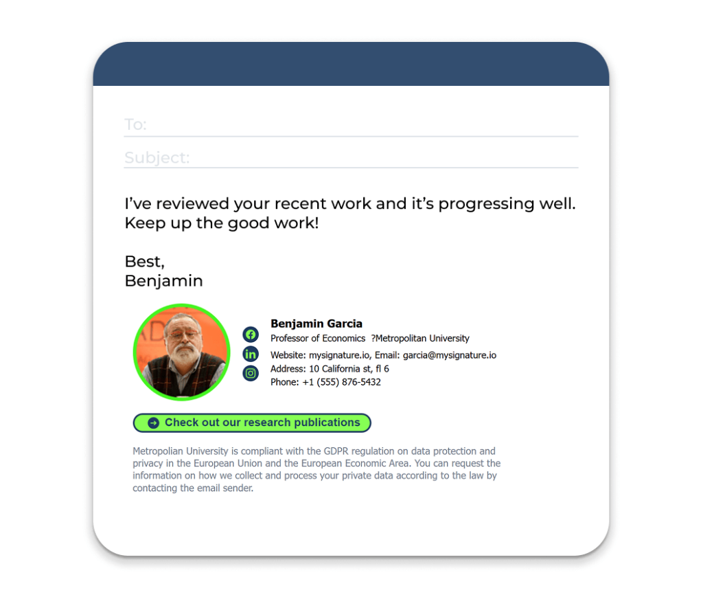
To ensure your email design and signature align, use an email marketing platform with a good email builder. This way, you can adjust components as needed, whether using a template or starting from scratch. Drag-and-drop editors allow you to upload and resize your email signature, while preview options ensure it displays correctly on all devices.
3. Segment your audience
You likely segment your audience for personalized emails, but should you adjust your signature? While your core contact information remains the same, you can customize graphic elements for your marketing message.
For instance, you could customize your email signature CTAs based on what would interest your readers and direct them to specific landing pages. Let’s say you sell outdoor adventure gear and you need to customize your email signature to target different audience groups. If they’re hikers, you should include a link to product pages with hiking gear like boots or backpacks. But if you want to target cyclists, you should use cycling accessories to lure them in.
You might also tailor signatures based on recipients’ places in your sales funnel, such as sending a welcome email that links to educational blog posts on your unique value proposition.
4. Measure the impact of your email signature
You’ve built your signature, aligned it with your email design, and adjusted it for different segments. Now, measure its effectiveness against your goals by selecting appropriate benchmarks and KPIs, which are essential for campaign evaluation.
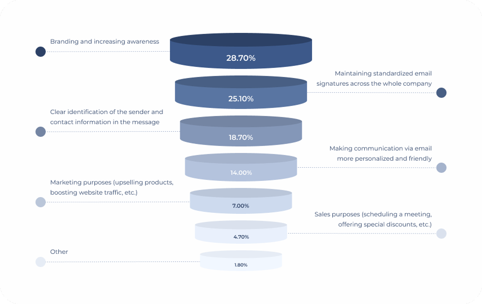
As shown in the diagram, email footers serve various purposes, with increasing brand awareness being a top priority. If that’s your goal, emphasize your business achievements for credibility. However, for brand consistency, a simple signature with essential company details is enough.
7 marketing best practices for your email signature to work
To represent your brand effectively, your signature must stand out and show your company’s true colors. Here are the best practices for supercharging your signatures.
1. Create a well-designed email signature
The way you decide to present the information you put in your signature is critical to its success. Here are some key aspects to consider:
- Keep your design simple. Less is more with email signature design. Make it clean and neat and avoid overloading it with unnecessary text or too many visual elements.
- Stick to a few colors in your signature palette – two or three colors work just fine. Use your brand color scheme to keep it consistent with your overall message.
- Pick web-friendly fontst hat match your branding. Some of the most popular web-safe fonts are: Arial, Times New Roman, or Tahoma. Don’t play with many different fonts since it will make your signature hard to read.

- Add a headshot instead of a full-body photo. Make sure you pose naturally and smile to be as friendly and warm as possible.
- Include social media links that match the rest of your signature. Try to include the social media profiles that are most relevant to your audience to avoid cluttering your email signature design.
- Mind simple design hierarchy to direct readers’ attention to the most crucial information. To do so, put the important components at the top and design them accordingly by using bold letters or large fonts.
2. Provide only the most valuable information
Have you heard about recipients not losing too much time reading through every email? The same goes for your email signature. So, including only the most valuable information to your signature is among the most effective email marketing practices.
You may ask yourself which are the key components of an email sign-off. These would be your first and last name, job title, company name, phone number, an active link to your website, physical address, and social media icons. Adding a professional headshot to put a face to the name is considered a great practice to engage your audience. And don’t forget about smiling.
This doesn’t necessarily mean that there’s a one-size-fits-all approach to what professionals should display in their signature. It all depends on your goals and email content. For instance, life coaches could benefit from adding a motivational quote while artists might leverage the occasion to include their YouTube channel trailer. The only prerequisite is that it feels relevant and matches your objectives.
Check how Dan Brown, a famous wildlife photographer, uses its email footer to promote its latest YouTube video:

source: desighhill
3. Stay on brand
Never underestimate the power of brand consistency. It’s imperative to create a coherent experience across all your marketing channels. So, make sure you inform your email footer based on your branding guidelines. Remember that it should set clear expectations and blend seamlessly with your branding as any other piece of your email campaign.
First, include your company logo in the form of an icon or thumbnail to design a branded email signature. Secondly, stick to using your color palette and choose a font that reflects your brand identity. You could consider adding branding messages in your signature if you feel it will serve your email purpose. Working with a 5 star-rated branding agency can help ensure that your logo, colors, and fonts are consistently applied across all emails and marketing materials.
Use multiple email signatures in Gmail to easily switch between personal, professional, or team-based sign-offs—perfect for managing different roles, clients, or communication styles in just a few clicks.
4. Make it mobile-friendly
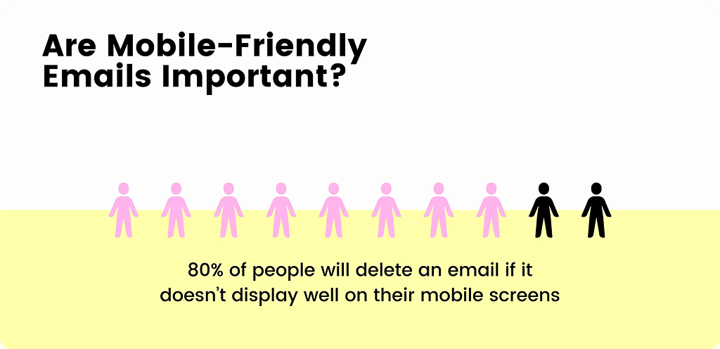
The number of users checking their emails on mobile devices is ever-increasing. So, creating an effective email signature design without ensuring it looks great across all devices might hurt the user experience. A non-responsive design can lead to poor user experiences, causing recipients to delete your email.
source: unlayer
Ensure clickable elements are visible with ample whitespace around them. Use readable fonts and colors that display well on smaller screens. Always test your email design for mobile responsiveness to see how components work across various devices and email clients. If you’re using Gmail on a smartphone, this gmail mobile signature guide can help you make sure your signature looks great on mobile too.
5. Add the right call to action
Your call to action (CTA) can make or break your email signature marketing. A powerful CTA is all you need to create an effective email signature—especially when you align it with your broader marketing strategy. Your email signature CTAs may range from asking for a review to signing up to your video website. Everything goes as long as it’s relevant to your business goals and is in line with your brand tone.
Adam Yaeger, founder of Llama Lead Gen, demonstrates this with a clean email signature and a prominent CTA to schedule calls. Remember, your signature should complement your message, so avoid being pushy.

source: databox
Test different CTAs – clickable links, buttons, or promotional banners – to discover what resonates best with your audience.
6. Use your signature to reflect your credibility
There’s more to your email signature than your contact information and CTAs. An engaging email signature is also the right place to express your values and leave readers with the most positive impression.
What’s more, adding your awards or badges to your email signature reflects your credibility and establishes you as an industry leader. Just make sure you don’t overdo it to keep your signature light and not overwhelm your readers.
7. Test and optimize
A common mistake in email marketing is assuming what works without testing. It’s essential to test your email designs to achieve the best results. Use A/B testing on your email signatures to find variations that perform better. Experiment with layouts, graphics, colors, and CTAs, but remember to test one element at a time. This way, you can identify what changes impact engagement and adjust your strategy accordingly. Just be mindful not to overload your signature—too much content might trigger an error message like “Gmail Signature is Too Long”, especially in Gmail.
Create a professional email signature that converts
Your email signature should make a lasting impression since it’s the final piece of information your subscribers see. As such, it offers many marketing opportunities, from increasing brand awareness to promoting your offering. More importantly, its look and feel should reflect your overall brand identity, helping readers understand what your business stands for.
If you haven’t invested in email signature marketing to guide your subscribers toward your goals, now is the time to start. Use our guide to develop an eye-catching email signature and incorporate it into your overall email marketing. Be sure to keep testing and experimenting with different signature versions to boost their effectiveness and drive engagement and conversions.

