Last Updated on 24.11.2025 by Danylo T
A professional email signature is a crucial part of any successful business communication. It serves as a way to differentiate yourself from other emails, give your message credibility, and remind the recipient of who you are. It’s also an excellent opportunity to showcase your personality, promote your business, or link to other important resources.
Contents
- What is an email signature?
- Why is email signature design important?
- Choose the right email signature layout
- Professional email signature design tips and principles
- How to format your email signature
- Email signature design don’ts
- Email signatures advice
- Email signature examples for inspiration
- How to create an email signature
A professional email signature design: what does it look like? Here we’ll explore tips and examples for creating an email signature that gets you noticed. So let’s get started!
What is an email signature?
An email signature is a short block of text that appears at the bottom of your emails. The signature can include info like your name, job title, company name, a link to your website, contact details, social media accounts, and other branding elements. In fact, your signature serves as a digital business card and is a part of every email you send, so it’s important to make sure you design a good one.
Why is email signature design important?
What is email signature design, actually? In short, email signature design is about how your signature looks.
Many people read a large number of emails regularly, and it’s easy to forget who they’re dealing with after only a quick scan-through. An effective email signature generator will help you to prompt the recipient to take another look at your email message and remember who you’re. It’s also a good starting point for some marketing techniques.
You might, for instance, include a link to some of your website’s useful resources or advertise a rewards program to people who read all the way through the email and make them an additional offer.

Choose the right email signature layout
First of all, try to arrange all the elements in your email footer so that they don’t make your design cluttered and overwhelming for your readers.
There are various layouts for your signature to consider. Still, as a general rule, your headshot or company logo should be placed prominently at the top or left, followed by your personal details, such as name, job title, company name, and phone number. Below are a few more examples of how you can place various elements in your signature or your digital business card.

Professional email signature design tips and principles
Finally, let’s dive deeper into ideal email signature design and its best practices.
General advice
When creating your effective signature, keep these tips in mind.
- Make it relevant. Your signature is part of every communication you make, so it must be appropriate to each situation. If you usually write emails to your friends, clients, and colleagues, you’ll want to ensure the signature you use is suitable for each. You can also have a few signatures.
- Check your spelling. Errors can be present in even the shortest passage of text. These minor imperfections have the power to spoil both the first and final impressions. So make sure to check the copy of your email footer.
- Optimize it for mobile. When creating a signature with images, make sure to make it mobile-friendly. 81% of people read emails on their phones. If the signature is blurry or pixelated, it will look unprofessional.
- Keep it simple. Less is more when it comes to making a well-designed email signature. Try to fit all the most important information into just three or four lines of text.
Informative elements
As a rule, an effective email signature contains your name, job title, and phone number, but if you want to use its benefits to the fullest, make the informative part longer and more detailed. Here’s what you can do:
- Show that you’re social. If your business uses social channels, you should put links to your profiles in your signature. You might also want to add a link to your personal LinkedIn/Youtube/etc. page.

- Add a call to action. This is a must if you want your signature to get people to do something immediately. With a compelling call to action that email recipients can click on, they can sign up for your newsletter, reserve a spot at an event, or download an eBook.
- Share a blog post. If you want to prove that you’re an expert in your field, why not include a link to one of your high-performing blog posts or any other relevant content? Centralizing your approach with gsuite signature management solution also ensures everyone in your organization shares those key links consistently.
- Add a legal disclaimer. If your field has specific email regulations or confidentiality requirements, consider adding an email disclaimer to your signature.
- Include your accomplishments. Are you in a field where clients expect to see your credentials? You should sign off with them. Include any awards you may have received to highlight your achievements, but make sure they are recent or current.
Visual elements
Adding the right image to your email footer is the cherry on top of the cake! It will help the recipient to make a personal association with you and your brand. So what images are right for a professional signature?
- Use a professional photo. While a personal headshot is fine, ensure it appears professional. Opt for a simple background for contrast with your face, dress appropriately, and smile. An AI headshot editor can enhance your photo, adjusting lighting and background for a polished look.
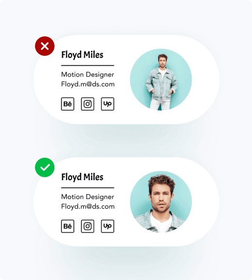
- Minimize logos and banners. While including a company logo can enhance brand cohesion, excessive images can clutter your signature and appear overly promotional. They can add GBs to your recipient’s inbox and appear salesy. Keep your branded images preferably around 50kb.
To create optimized visuals without overloading emails, use prompts for AI logo generators to design lightweight, professional logos that maintain brand identity while keeping file sizes small.
- Include space and space dividers. Ensure there’s ample space around your details for a clean look. If your signature feels crowded, consider adjusting text color or using separators to organize the layout.
How to format your email signature
Creating an effective email signature isn’t difficult, but it does require some thought and planning. Using an email signature manager can streamline this process, enabling you to standardize layouts, fonts, and visuals across all company email accounts with minimal effort. Have a look at our tips if you need help with the format of your email signature.
- Choose the right size. For design, delivery, and display, we recommend email signature dimensions of 300-400 pixels wide and 70-100 pixels high. It’s best to keep the size of all images in your signature less than 50kb.
- Use hierarchy in the design. Think about how you read something on a page to figure out how to make the best email signature. Your signature’s design hierarchy should draw the reader’s attention to the most essential details first by using scale, color, and font size.
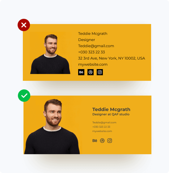
- Think of the alignment. While your email footer shouldn’t appear “boxy,” proper alignment enhances balance and highlights contact information. Align essential elements based on your logo’s position, as left-aligned text is the easiest to read.
- Control your color palette. Color always draws attention, but it’s vital to know where to stop. As we’ve mentioned, we recommend you stick to a few key colors that go well together.
- Use pictures smartly. People remember images better than words, so it’s a good idea to put an image in your email signature (a headshot, a logo), but don’t use too many. Also, make sure that your images are embedded, not attached.
- Choose a web-safe font. You don’t have to use just one font in your email signature, but choosing more than two isn’t a good idea. We suggest using a font size of at least 10pt. Ensure compatibility across browsers by using web-safe fonts like Arial, Verdana, Georgia, Tahoma, Courier, Times New Roman, Trebuchet, Palatino, or Lucida.
More on email signature images
As you can see, your image is usually an essential part of an email footer. However, if you go wrong with its proportions or size, people may not see it as you intended. Follow the recommendations below to make sure you choose the right image.
| Format | Size | Proportions | Resolution |
| The best file formats for images to use in email signatures are PNG and JPEG. | As a general rule, the smaller the size of the image in your email signature, the better. Try to keep it no more than 50 kb. | The optimal size for logos and photos is between 100-300 pixels wide. | We recommend saving your image at 72 dpi. X 2 dpi if you want to avoid images becoming blurry on Retina displays. |
Email signature design don’ts
Try not to ruin your professional email signature with any of the following no-nos.
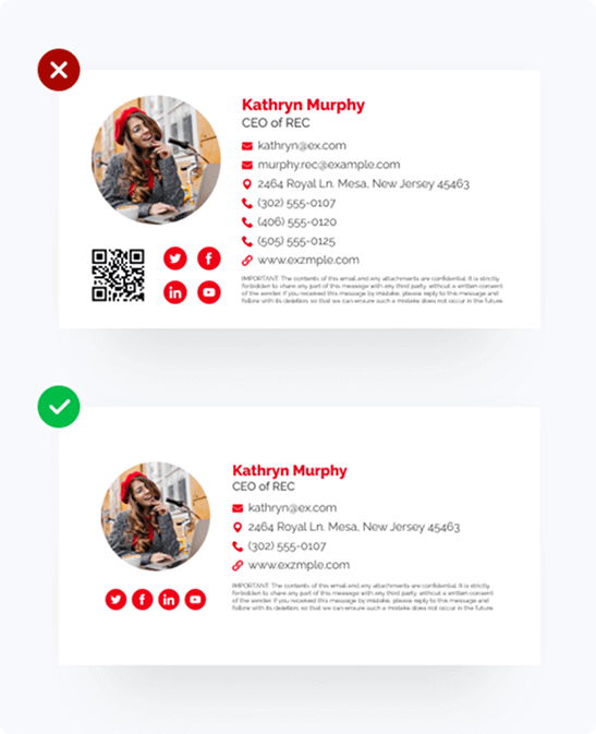
- Don’t include everything. You’ve probably seen those long email signatures that are hard to read. These can have ten or more lines and contain excessive information. Such signatures can seem annoying or like desperate attempts to get people’s attention.
- Don’t make your signature an image.The person who gets your email might have it set to block images automatically. That means that if you use an image instead of your signature, they will never see it.
- Don’t experiment with GIFs. Incorporating interactive elements like animated images can be effective for adding motion and a dynamic feel to your email signature design. While the online animation is fun, keep in mind that some email clients don’t support it. So the GIF will show up as a still image instead. That’s why the first frame must be applicable in case your recipient won’t see the whole animation.
- Don’t list too many ways to get in touch with you. Include one or two of the best and fastest ways to contact you.
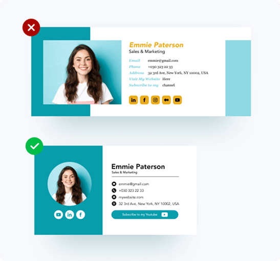
- Avoid personal quotes. To promote a professional identity, keep your email focused on relevant information. Unless you’re a celebrity, personal quotes can appear excessive and unprofessional.
Email signatures advice
No matter your profession – business, marketing, sales, or creative – a simple email signature improves professionalism, communicates essential info, and increases brand visibility. It’s vital to customize your signature for various audiences. Let’s see how professionals can enhance their signatures.
Email signatures design advice for businesses
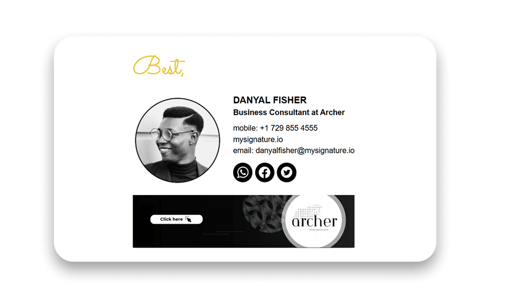
Create a professional email signature for your business by keeping it simple and aligned with your mission. Include your name, business name, contact info, website link, and relevant social media icons. Use a consistent photo that reflects your company.
Email signatures design advice for startups
Did you know that an email signature can bring 300-500 extra leads per month for your startup? Transform your outgoing emails into a powerful tool by including your logo, contact info, and social media links. Don’t forget a clear call to action. Use a striking font and color scheme to stand out, but keep it balanced.
Email signatures design advice for marketing
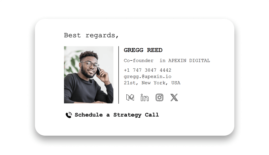
As a marketer, craft an eye-catching email signature. Include links to your website, social media links, and recent content. Add a call to action, like “Follow us” or “Download a guide.” Ensure it is creative and reflects your brand’s personality.
Email signatures design advice for sales
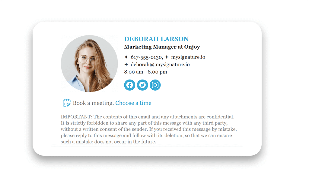
Your email footer should be professional and focused on getting people to take action. Include a link to a contact page, your social media profiles, and any special offers or promotions you’re running. You can also include a “Book a demo,” or “Book a call” button that links to a contact form. Use a casual yet professional tone.
Email signatures design advice for creative people
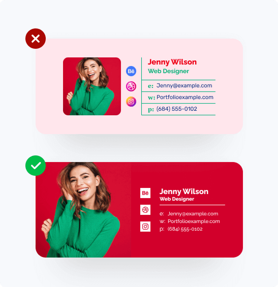
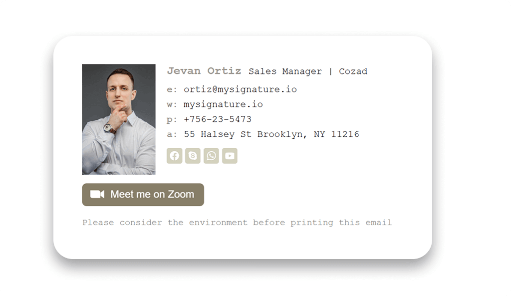
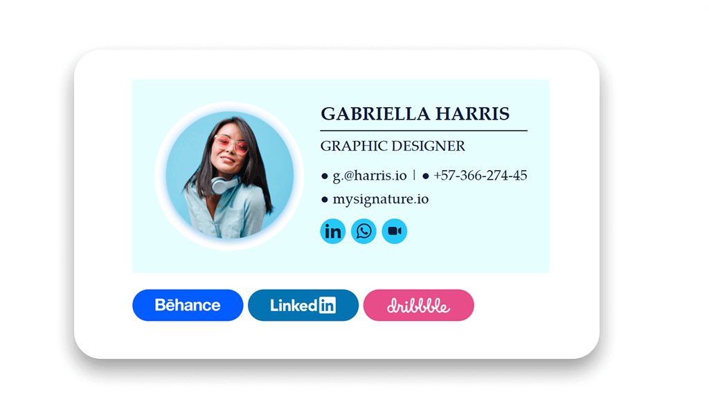
If you’re a creative individual, you want to have a signature that’s unique and reflects your artistic style. Add a memorable photo that helps people understand who you are and what you do. Include a link to your portfolio on Behance or Dribbble and any relevant contact information. You can also add some links to your social media profiles.
Email signature examples for inspiration
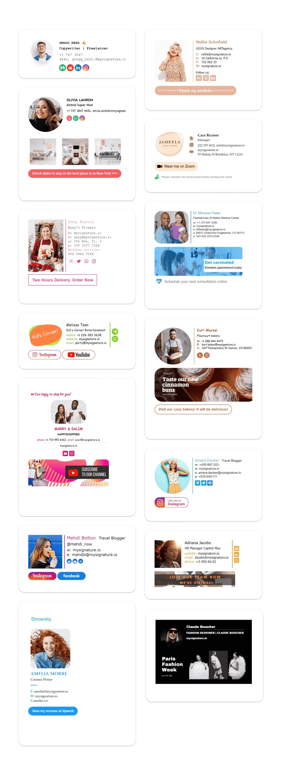
Are you looking for some new ideas on how to spruce up your business email signature?
Check out these amazing email signature design examples for some inspiration!
How to create an email signature
As you can see, designing an email signature isn’t difficult, but it’s important to make sure that it looks professional and reflects your personal brand. The right signature format can create a lasting impression and significantly contribute to your success. So how do you design a good signature?
If you’re tech-savvy, you can create it using Adobe Photoshop or Microsoft Word. However, to achieve the most professional email signature result, we recommend using dedicated tools such as MySignature. This email signature generator provides customizable templates that allow you to personalize fonts, colors, and logos. After creating your signature, simply copy and paste the HTML code into your email account. MySignature saves time and ensures a consistent email signature every time.
Conclusion
We hope this guide has answered your questions about how to design an email signature. These are suggestions, not rules, so try different things to find out what works best for you.
Good luck!

