
Last Updated on 30.06.2026 by Danylo T
The perfect and brilliant email signature design is important for the final messaging results.
Meanwhile, if you are not a professional artist or designer, this task may be challenging or daunting for you. Being a marketing expert or an executive director, you certainly use the words proficiently, communicating the relevant information, using the appropriate narrative style. But what about the colors? How to select the most suitable ones, mix them properly, create a colorful harmony?
Just use the professional templates by MySignature, consider the color transfer by the displays of various devices, start experimentation, and get top email signature design results.
TL;DR:
👉 MySignature 2025 analysis of email signatures found that monochromatic palettes reduce email ‘visual noise’ by 23%, leading to faster response times.
👉 The most effective professional email signature colors for 2026 are Navy Blue (#2C3E50) for trust and Slate Grey (#7F8C8D) for neutral hierarchy.
👉Designs must maintain a 4.5:1 contrast ratio and use transparent assets to support Dark Mode rendering across email clients.
So how to choose colors for the email signature like a pro?
Contents:
- The basics of color psychology for email signature
- What colors to use in an email signature design in 2026?
- Dark vs light colors for email signature
- Modern Color Trends in 2026
- FAQ
The basics of color psychology for email signature
Taking into account the email content, focusing on your messaging purpose, select the right colors to communicate your mood, the company mission and the necessary call to action. The shades and tones you select can make the recipients feel secure, vigorous or inspired.
The basic colors commonly speak for the certain concepts:
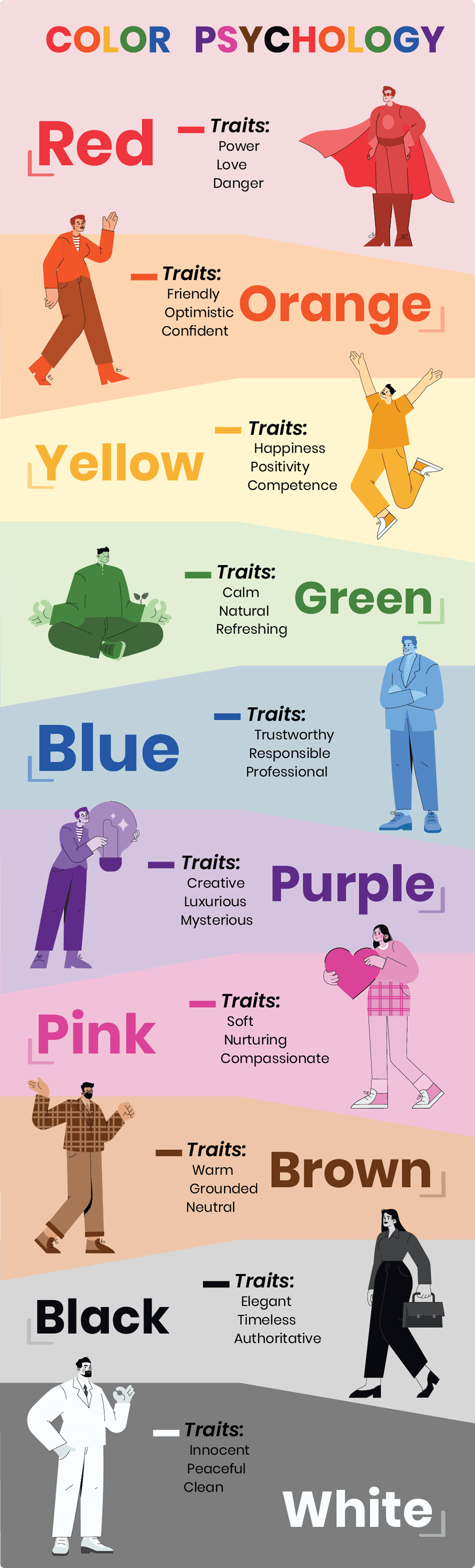
- red – passion, energy and familial love;
- orange – youth and happiness;
- yellow – positivity, clarity and optimism;
- green – wellness, stability, trust and environmental awareness;
- blue – serenity, loyalty and wisdom;
- purple – royalty and extravagance; the mix of energy and stability.
Blue color represents stability, reliability and coldness. It is commonly associated with water and suitable for branding financial services, electronics, ventilation, various water and sea products, fresheners, etc. However, this color is cold, known as an appetite suppressant, so isn’t recommended for the foodstuffs and food-related products.

Yellow symbolizes sunshine and happiness. It is commonly associated with joy, intellect and positivity, being bright and warm. Widely used in street signs or gas tubes, it represents caution. This color is attention-grabbing and playful. It may be used to depict cheerfulness and fun. Therefore, it is perfectly used for children products, taxi cabs, construction equipment, case studies, fast services and champagne.
But it may have a disturbing effect, being too bright for an email signature. So, try not to overuse it, adding only several bright logo details. Combination of yellow and black is classical, looking rich and suitable for multiple business purposes and various events. Combining this color with violet is congenial only for the seasonal, Easter greetings, looking festive and too bright for daily routine.
Red is the color to stimulate activity and hunger. It is perfect to grab the reader’s attention, symbolizing passion or danger. Thus, red is typical for fast food products and companies, restaurants and nightclubs. It is also associated with masculine energy and Christmas, being essential for the seasonal greetings and invitations to holiday events. However, in business letters, it is to be used in moderation as it may be perceived as aggressive and tiring.

Green is commonly associated with nature, wellness, money and harmony. Additionally, it symbolizes fertility, growth and safety. Thus, it is perfectly used in branding of prestigious products, food-related items, health and financial services. It can symbolize natural and organic products, communicate trust and wisdom. However, in business letters, green color should not be plentiful, as it can be associated with a materialistic, selfish and indifferent approach.
Orange color is also infrequent in business correspondence, being positive, a great appetizer, but too bright for official letters.

Purple is more typical, as it is associated with perfect sophistication and luxury. It is used to highlight your creativity, high social status or power.

Meanwhile, don’t forget about black and white. These colors are always appropriate, being the most elegant and formal.

White is associated with purity, perfection and safety. Black denotes power and authority. Together these two basic colors make a great combination, generally accepted and essential for every email signature.
What colors to use in an email signature design in 2026?
Use your logo colors (brand colors)
Commonly, when you start creating a bright and unique email signature, the company logo already exists. Its colors should be the base for your signature design and in most cases, it’s better to keep the main text and background neutral, using your brand colors only as accents.
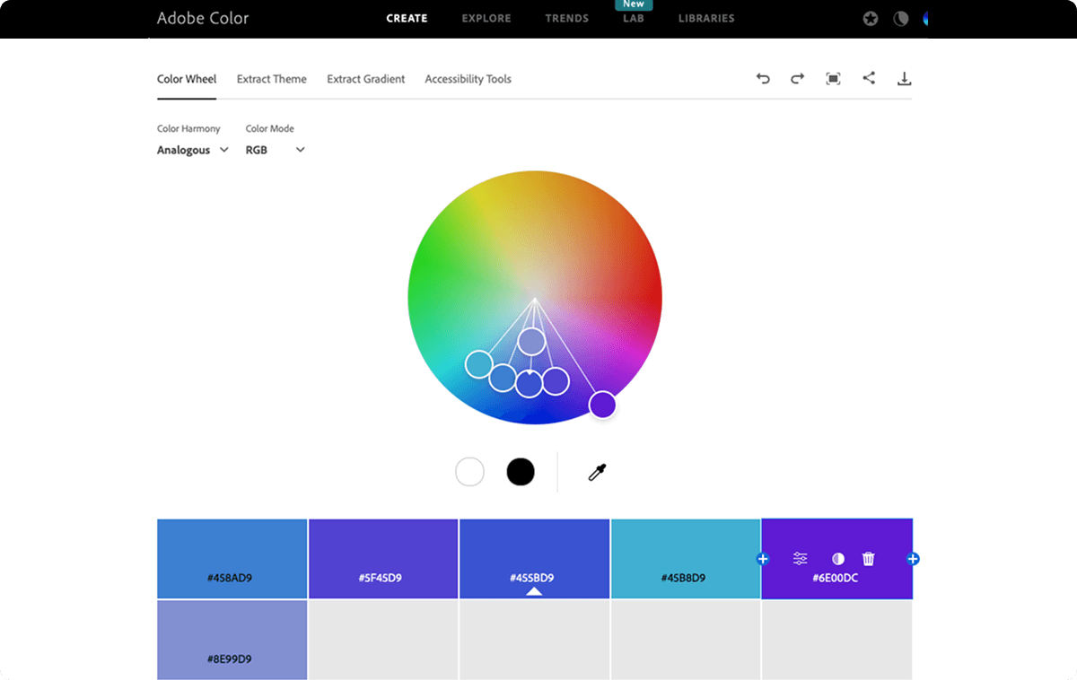
Use color wheel
To make your signature look consistent and professional, open a color wheel or palette and pick the shades you prefer, using RGB or HEX values (and CMYK only if you’re preparing print materials). You can use the Adobe color wheel, Paletton services.
Keep your email signature color palette simple
For email signature color use 3–6 colors max, but keep it simple: one main color, one secondary color, and one accent color for links or buttons.
Use the 60/30/10 rule to avoid the “rainbow effect”
You can use the 60-30-10 rule (balance of colors):
60% dominant color (often primary brand color)
30% secondary
10% accent (for buttons, links)
This rule creates harmony and visual order and helps avoid a “rainbow effect” and makes your signature easier to read.
Match colors to your message and industry
When choosing your palette, think about harmony, contrast, and the goal of your message.
For example, if you’re a photographer, choose tones that won’t clash with your portfolio images. If you’re sending seasonal campaigns (like Christmas greetings), a more colorful signature can work, but it should still feel balanced and not overpower your name and contact details. Use service Logomak.com
Test in real email clients
Also, keep in mind that colors may look different across email clients (especially in Outlook) and in dark mode.
Before you roll out a new signature, test it on desktop and mobile to make sure it stays readable and your links still stand out.
Check color correction for banners and images
Finally, pay attention to color correction if you add email signature banners or images, so everything looks consistent in the final email.

Looking for email signature banners?
Open MySignature’s signature editor and upload the banner image directly into your signature.

Dark vs light colors for email signature
Dark mode has quietly become one of the biggest reasons email signatures stop looking the way you designed them. A signature that looks clean and professional on a white background can suddenly feel broken in dark mode: logos disappear, text loses contrast, and icons turn into weird blocks.
Depending on the platform, dark mode can automatically adjust backgrounds and invert or shift colors in ways you don’t control.
The best way is to design your signature so it stays readable in both modes, instead of trying to “force” one perfect look:
- Use neutral backgrounds (or no background at all) so the email client can adapt naturally.
- Avoid pure black (#000) and pure white (#FFF) – mid-tones (dark gray / light gray) are more stable across themes
- Use transparent PNG logos to prevent ugly white boxes and keep your logo clean in dark mode.
- Test your signature in real clients (Gmail + Outlook + mobile) before rolling it out, because results vary by platform
In general, if your signature still looks clear in dark mode, it will almost always look great in light mode too.
Modern Color Trends in 2026
Whereas the official emails are basically neutral and modest by colors, bright hues lovers get unique opportunities nowadays. The most fashionable tints now are:
- dumped (bubble gum) pink – #FFB6C1, #FF8FAB, #F4A3B4, #EFA7B5;
- neutral metallic – #C0C0C0, #D4AF37, #B08D57, #E5E4E2;
- ultraviolet – #5F4B8B, #6F2DA8, #7F00FF, #4B0082;
- pastels – #A7C7E7, #B5EAD7, #FFD1DC, #FFF1B6;
- black -#1A1A1A, #2B2B2B.
The beautiful color gradients are used to create a semi-flat signature or email header design. Even the combination of several bright colors, for example, yellow, blue and red is acceptable this year, but for special purposes, for example, for the theatre bill designing or for the fashion show invitation.
So, use the design basics and modern trends to create your perfect and unique email signature.
FAQ
Is white color good for email signature background?
White (or a clean neutral background) keeps your signature looking professional and readable, and is often recommended because it ensures strong contrast with text and icons, especially if you’re using brand colors for accents. However, pure white backgrounds can shift in dark mode on some devices, so adding subtle shading or testing it on real clients is a good idea.
Why is my email signature color not showing correctly?
Signature colors sometimes don’t show correctly because different email clients (like Outlook vs Gmail) and dark mode can override or render HTML/CSS differently — especially background colors or embedded images. To fix this, use web-safe colors, transparent logo images, and test your signature across platforms before sending. Read our guides for it.
What are the best colors for email signature in marketing emails?
For marketing emails, aim for 1–2 bright accent colors combined with complementary neutrals to maintain readability and brand consistency; bright accents can draw attention to CTAs without overwhelming the reader. A neutral base with small pops of on-brand color tends to perform best.
This was very helpful. Thank you so much.