Last Updated on 30.06.2025 by Danylo T
Key takeaways
👉 Email footers enhance brand identity by serving as a professional and informative closing section, incorporating contact details, logos, and CTAs.
👉 Compliance is essential, ensuring your email footer includes unsubscribe links and legal disclaimers to adhere to regulations like GDPR and CAN-SPAM.
👉 Engage subscribers effectively by using concise, visually appealing designs with social media links and personalized CTAs.
👉 Stay adaptable with regular updates to footers, aligning them with campaigns, product launches, or seasonal offers for greater impact.
Contents
- What is an email footer?
- Essential elements to include in your email footers
- Best practices to follow for effective email footers
- Email footer tips and examples
- Create an email footer in just 2 minutes with MySignature
Email footers are like the cherry on top of your message – they round it off nicely and add some important details. Not only do they mark the end of your email, but they also give you a chance to share valuable information.
A great footer can include lots of useful things like unsubscribe links, contact details, special offers, and links to your social media pages. Each piece should fit together and help improve your readers’ experience and give them clear options.
In this article, we’ll explore what makes a great email footer, share some tips for effective design, and provide some cool email footer examples to inspire you. Let’s try to create something that not only informs, but also engages your audience and leaves a lasting impression.
What is an email footer?
You may wonder “What is an email footer?” Here is the answer. An email footer is the little section at the bottom of your emails where you can share your business contact information, any important legal notes, links to your social media profiles, a quick link to your website, company slogan, and even an unsubscribe option. Basically, it’s a great place to add a friendly message that connects with your customers and even gives them a glimpse into your brand’s mission. Besides, to enhance your digital presence you should consider yousing digital business cards; learn more about how to share digital business cards easily.
Essential elements to include in your email footers
Let’s look at the key elements of a successful footer for email.
1. Unsubscribe link
Make sure to have a clear unsubscribe button in your emails. This way, if someone wants to stop getting your messages, it’s super easy for them. Being upfront about it shows you care about what your readers want, and it helps keep their trust.
2. Preference center
Having an email preference center is a great idea because it gives your subscribers a say in how often they hear from you. In the end, the ability to tweak the settings can make them keep around instead of opting out completely.
3. Contact details
What if subscribers want to contact you after reading your email? While they can reply directly to your business emails, it’s helpful to include additional contact info, such as your phone number and physical company address.
This is especially important for businesses with a physical location because it makes it easier for potential clients to find you. For example, a local bakery might include its address and phone number in the company email footer to encourage walk-ins and inquiries.
Note that if your email address is the same as the one used as the sender, there’s no need to repeat it; keeping this closing area simple is often best.
4. Company’s logo
When incorporating branding elements, ensure your logo prominently appears in every message. This common type of branding not only highlights what your brand represents but also reinforces brand recognition. Just make sure the images are clear and display well on any device. It is about having a footer that emphasizes core brand elements, including the fonts, colors, logos, and message, enhancing brand consistency. This improves brand recognition or awareness, reinforcing brand recall and makes it easier to track consistency using a contact details scraping tool.
5. Social media channels
If you want to connect with your subscribers beyond just email, think about linking your social media profiles. This way, you can create a more unified email marketing strategy and keep the conversation going across different platforms.
Make sure to add buttons for the social media sites where you’re most active. And don’t forget to keep those channels updated with fresh, interesting content to keep your audience engaged and in the loop.
6. Legal disclaimers
Adding some important legal stuff to your email footer for business is a smart move. Things like copyright info, anti-spam rules, links to your privacy policy, and terms of service can keep you on the right side of laws like the CAN-SPAM Act and GDPR.
When you include these details, you’re not just protecting your brand, you’re also helping to keep your sender reputation solid. This way, your email marketing stays effective and respectful of your subscribers’ rights.
Optional elements to include in your email footers
Besides the must-have parts mentioned earlier, you might want to think about a few extras:
1. Product updates
Including product updates in your footer is particularly beneficial if you offer software or subscription-based services. This keeps people informed about any changes, new features, or important announcements related to your product.
2. CTAs
Your email footer is a great spot to add calls to action that can really help boost your sales, especially in email marketing campaigns. Think about showcasing a recent product launch, a new blog post, or an upcoming webinar. Make sure your CTAs fit your business goals, and use some eye-catching designs to make them stand out from the rest of the text.
Using an email signature for Google Workspace platform like MySignature also helps centralize your CTA placements, making it easier to test and deploy banner messages in Gmail-based workflows.
3. “Green” message
If you want to convey your commitment to sustainability, consider green email footers. This could be a gentle reminder for readers to think about the environment before printing the email, encouraging eco-friendly practices and highlighting your brand’s dedication to promoting a more sustainable lifestyle.
Best practices to follow for effective email footers
Now let’s take a look at what you need to do to make your email footer shine.
1. Organize your footer
Keep your footer neat and easy to read. Put the essential information at the top and follow it with the less critical stuff. Using headings can make it all clearer.
2. Play with colors
Make your footer pop by choosing colors that contrast with the rest of your email. This helps people notice it as a separate section that matters.
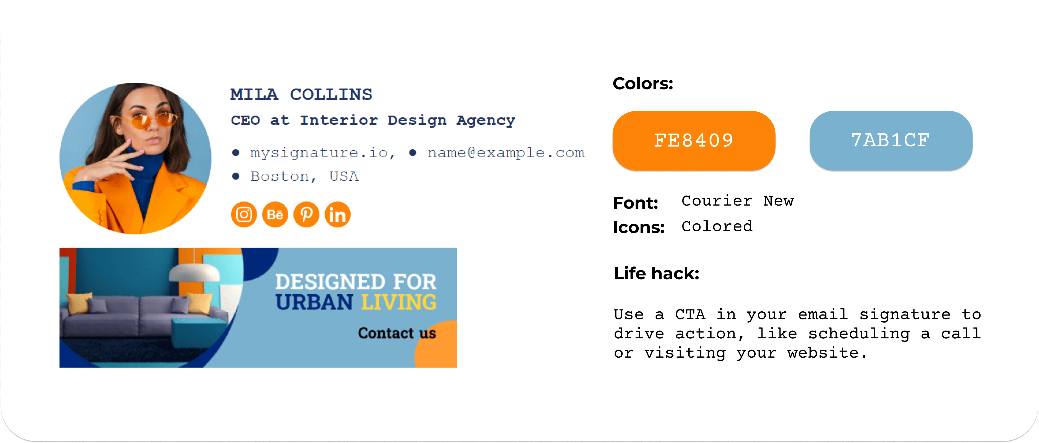
3. Add images and your logo
Adding some images and your company logo to your footer is a great way to make it eye-catching and help people remember your brand. Just make sure the images are clear and look good on any device. If you’re not sure where to start, here’s a quick guide on how to add an image to Gmail signature.
4. Add a personal touch
Think about throwing in something like a survey or feedback form. Getting responses can help you connect better with your audience and learn what they like.
5. Encourage sharing
Add social media icons that let readers easily share your content. This can help you reach more people. To improve efficiency, make sure the icon of the social media platform with the most engagement goes first. Then the rest follow according to the engagement data.
6. Check compatibility
Make sure your footer looks good on different email providers and devices. If you create an email footer with MySignature, you don’t need to worry about compatibility. Your footers will look great across various email clients and devices.
Email footer tips and examples
Before you start creating your new footer, here are some tips and best email footer ideas for inspiration.
Tip 1: Keep footer content concise for clarity
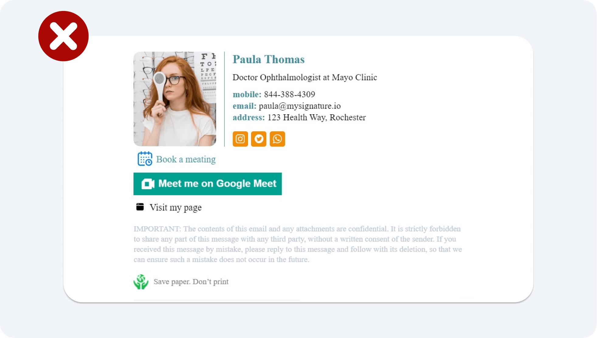
When working on your email footer design, remember that less is often more. Avoid overwhelming your readers with excessive information and focus on including only the essential email footer elements. A concise footer increases readability and ensures that your key messages stand out. Below is an example of a well-crafted footer that illustrates this principle beautifully. Note how its brevity contributes to its effectiveness.
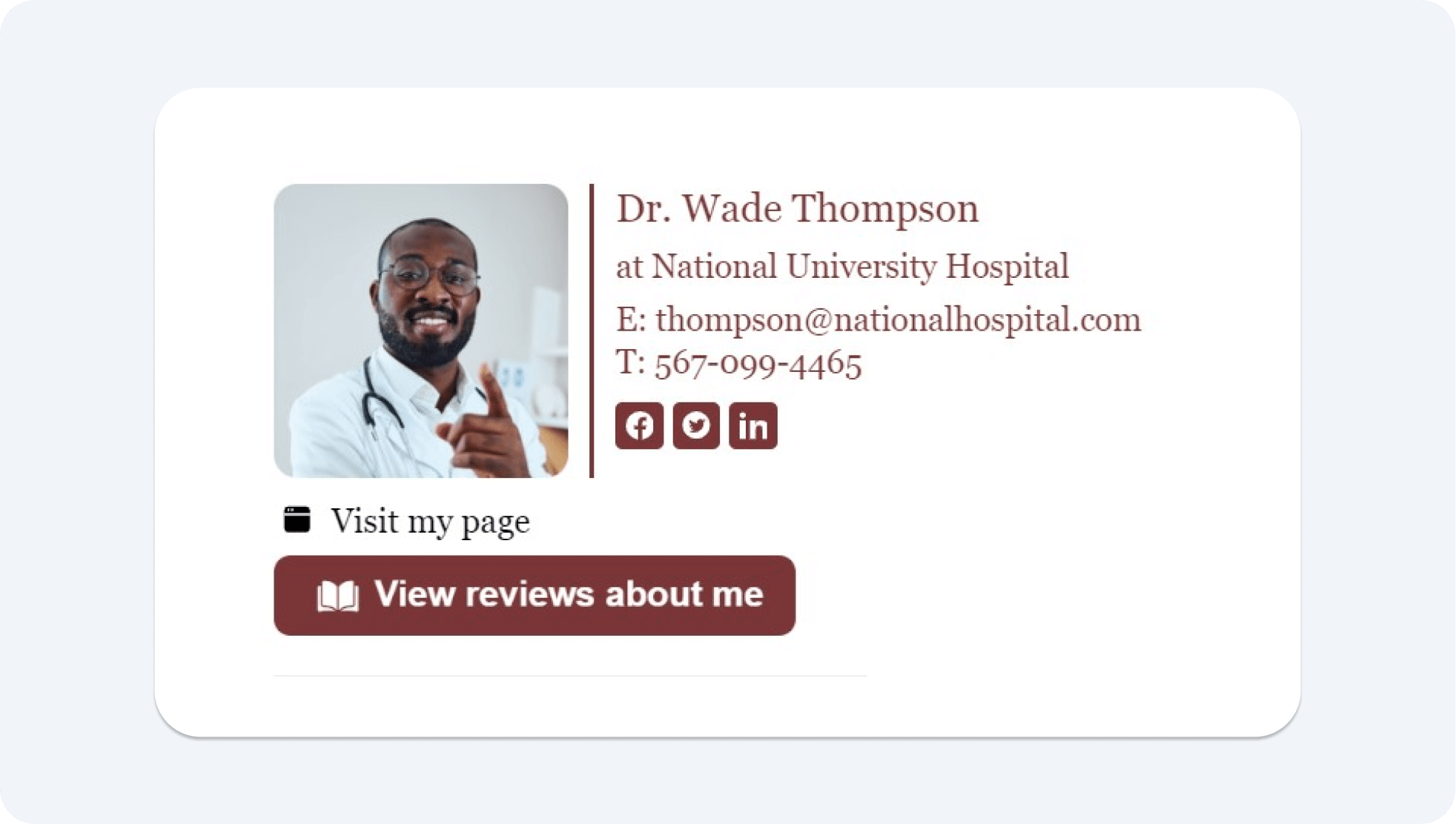
Tip 2: Use a limited color palette for visual impact
When designing your footer, stick to a maximum of two contrasting colors that align with your brand identity. This not only creates a visually appealing footer but also ensures consistency across your marketing communications. Using too many colors can distract from your message, while a focused palette enhances clarity and brand recognition. Check out the example below to see how effective this approach can be in creating a cohesive and attractive closing section.

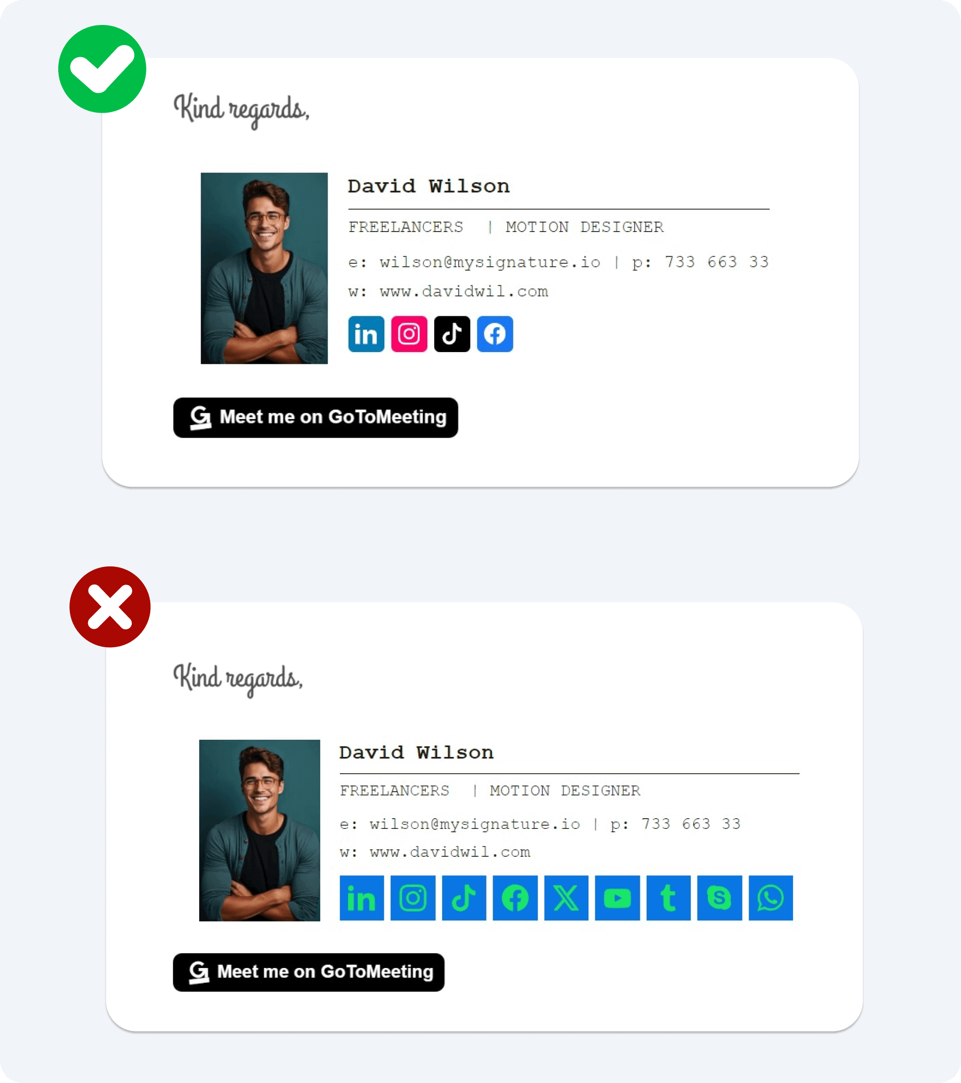
Tip 3: Use consistent social media icons
When adding social media icons to your email footer, ensure they are consistent in both style and size. Choose icons that match your brand’s aesthetic, whether that’s a sleek modern look or a more playful design. Keeping them uniform helps maintain a clean and professional appearance.
Tip 4: Make CTAs stand out
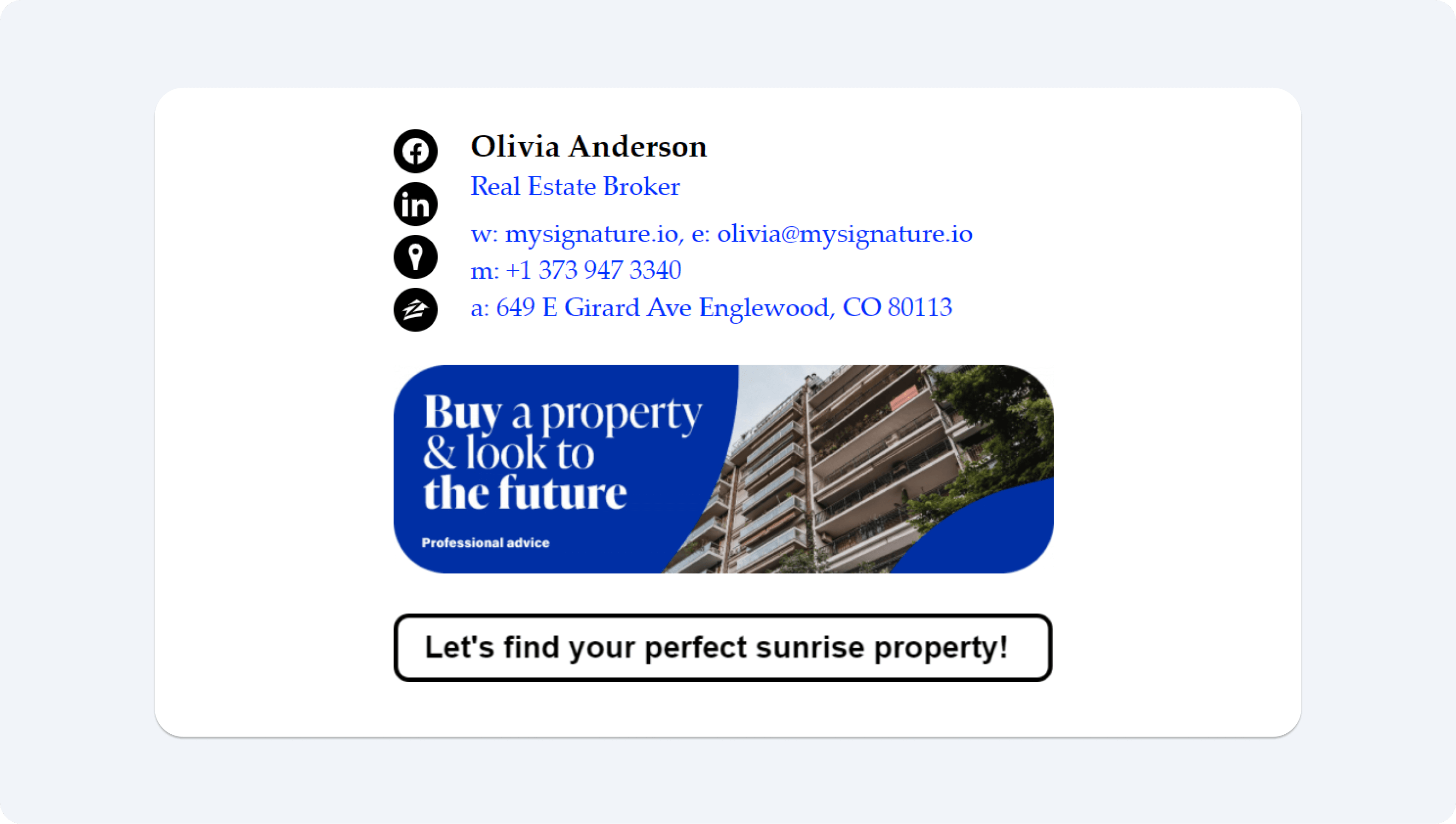
When you include calls to action (CTAs) in your footer, make sure they stand out. Use a contrasting color and a bold font to draw attention. Positioning your CTAs in a button format can also improve click-through and conversion rates.
Tip 5: Don’t overload your footer with too many links or buttons
Keeping it simple makes it easier to track how well each one performs. Fewer options help you see what your readers are most interested in, allowing you to improve your email marketing efforts for better results.
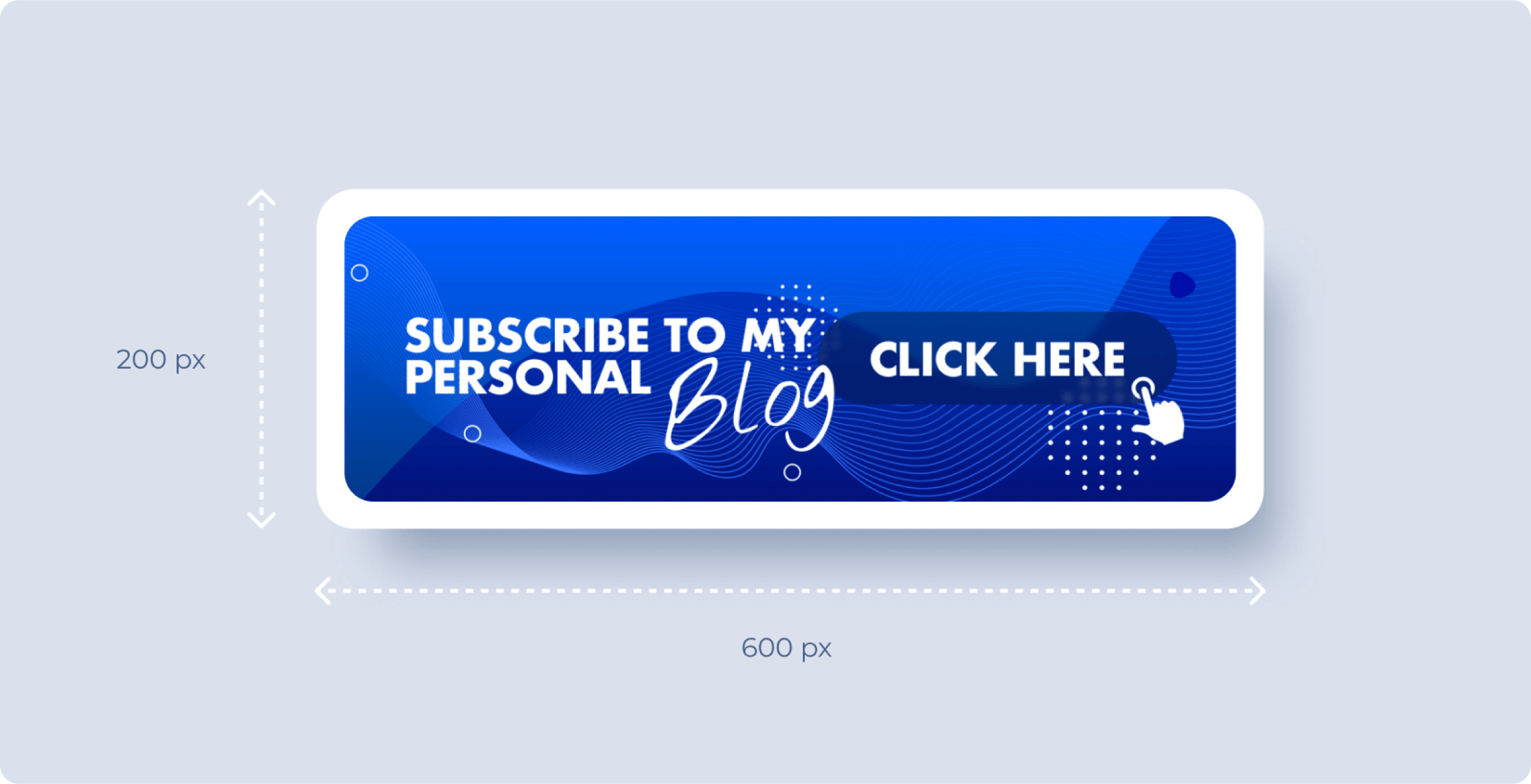
Tip 6: Don’t overlook the potential of your email footers for marketing
They are a great spot to promote sales, new product launches, blog posts, events, or encourage visits to your website. You can do this by adding eye-catching banners for email signature with CTAs that spark curiosity and invite readers to learn more. The banner image should be around 600 x 200 pixels for most emails, but for Outlook messages, 100 pixels in height is often preferred due to display differences. For example, if you’re sending a monthly newsletter, you could include a banner that highlights your latest e-book, prompting readers to download it.
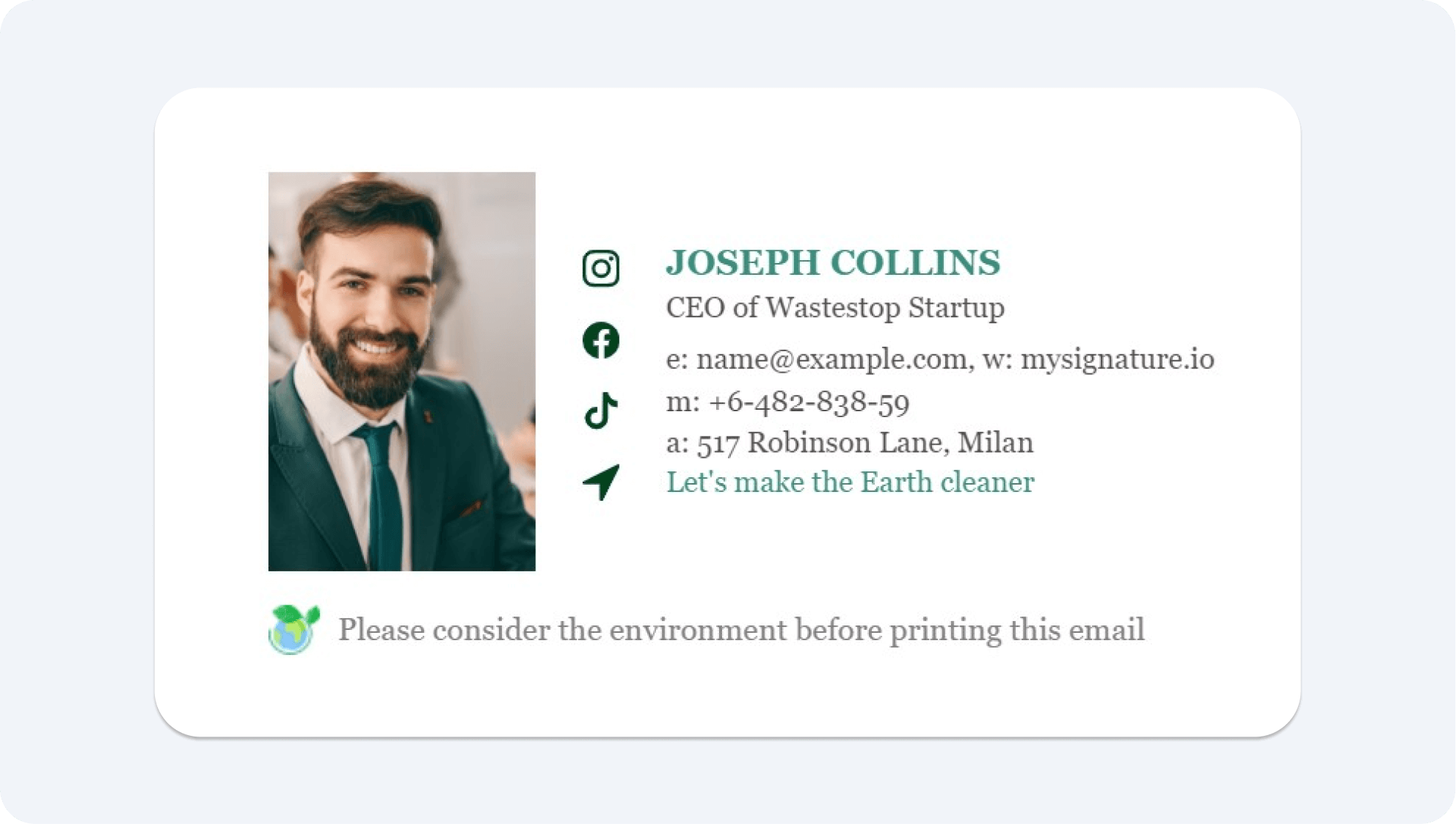
Tip 7: Show your commitment to sustainability or other initiatives
Incorporate a green statement in your footer to demonstrate your commitment to sustainability. Go beyond a generic message by specifying the actions your company is taking, such as carbon offset initiatives or eco-friendly packaging options. You can use this same approach to highlight other key aspects of your brand, such as ethical sourcing practices, community involvement, or charitable initiatives.
Tip 8: Don’t forget those email footer legal compliance requirements
Is your email footer legally compliant? It’s really important to include the right legal stuff in it. Most email services expect you to have an unsubscribe link to keep things respectful for your subscribers. Make sure to put that unsubscribe link at the bottom of your footer in a smaller, lighter color like gray. This way, it’s there when people need it, but it won’t take over the whole design. And don’t forget to link to your brand’s privacy policy. This not only keeps you compliant with different rules but also contributes to building trust with your audience. If you can, consider adding a multi-language option so even more people can understand your policy.
Tip 9: Update your footer periodically
Keep your emails engaging by updating your footer regularly, not just after a brand revamp. Regular updates allow you to test different footers, helping you promote specific messages or offers in one email while highlighting something different in another. This approach keeps your content fresh and can reveal what resonates most with your audience.
Create an email footer in just 2 minutes with MySignature
Not sure where to start? Try MySignature! Creating the perfect footer can feel like a daunting task, but MySignature simplifies the process. Our easy-to-use email signature generator lets you design a footer that meets all your needs in just a few minutes, effectively turning your email into a digital business card.
Once you’ve crafted your personalized signature, you can enhance it further. MySignature offers industry-specific footer designs, featuring a variety of pre-made email signature templates suitable for businesses like real estate, finance, photography, legal services, and much more. This way, you can quickly find the ideal design that resonates with your brand and audience.
