Last Updated on 18.12.2025 by Vasyl Holiney
Email marketing is one of the most effective ways to promote your business, whether you’re in retail, travel, or any other industry. It’s fast, cost-efficient, and allows you to send personalized, real-time messages to your audience.
However, with the flood of emails people receive daily, it’s becoming harder to stand out. Many messages end up in the trash without being read, which means your emails need to be more than just informative — they need to be eye-catching and memorable.
That’s where email signature banners come in. A well-designed banner can make your emails more attractive and help you capture your audience’s attention, making your marketing efforts more successful.
In this article, we’ll cover everything from an email signature banner design to instructions on how to add these banners. Let’s get started.
What is an Email Signature Banner?
First, a few basics. An email signature banner is a graphic that adds a visual boost to your email sign-off, making your messages more engaging and professional.
These banners can say anything from promoting a new product or service to announcing an upcoming event, offering a discount, or showcasing your brand’s logo. For example, if you’re launching a new product, a banner in your signature can grab attention of potential customers, encourage clicks, and bring extra traffic and sales. Well, who doesn’t want it?
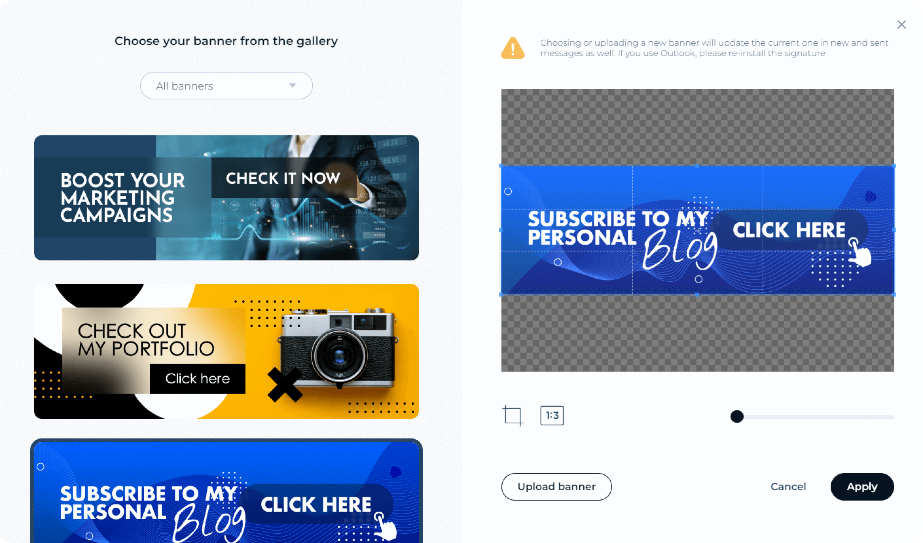
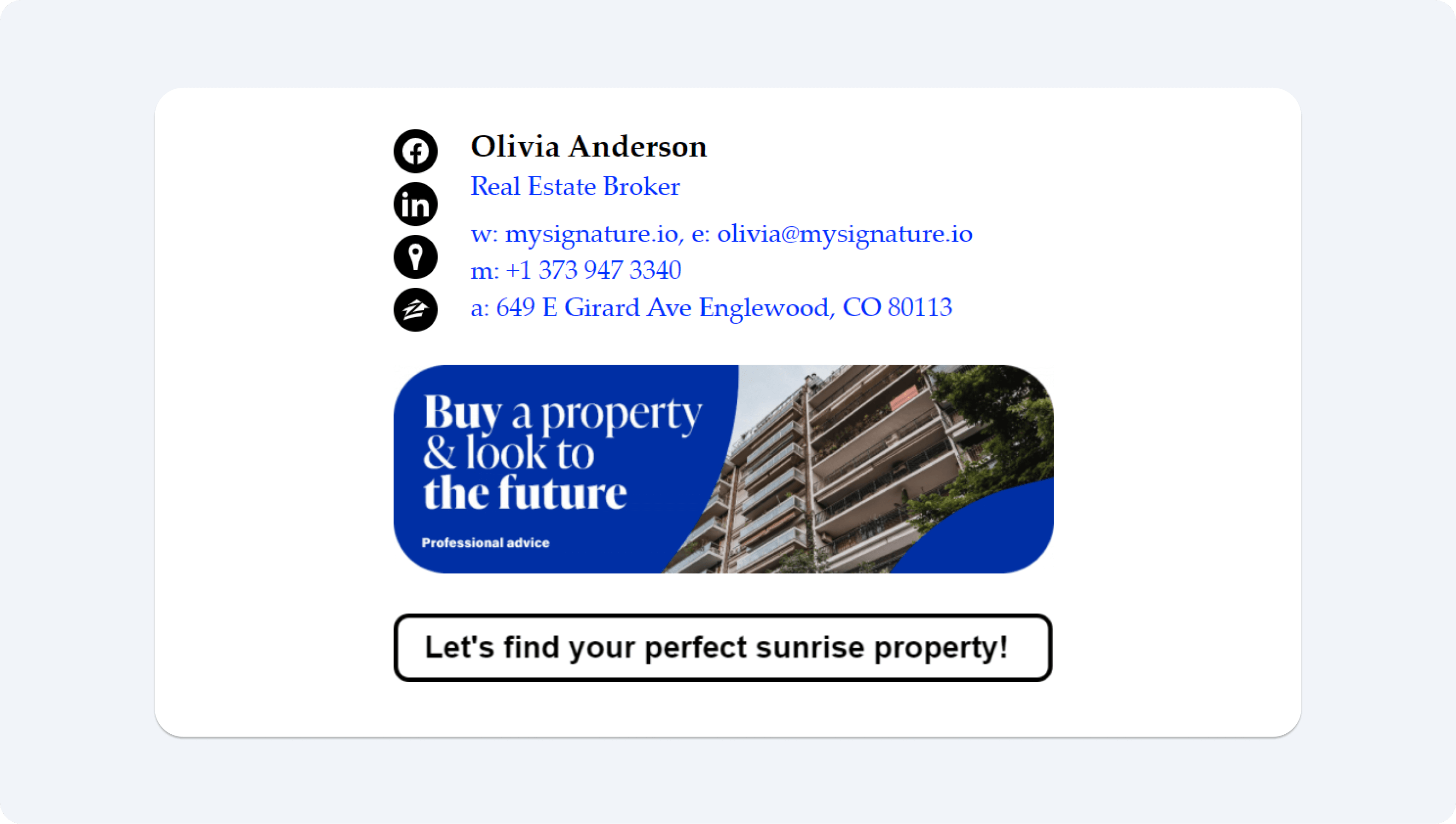
Email signature banner examples and designs
We bet you already want to have this banner in your email sign-offs. Good news is that when it comes to creating effective email signature banners, the possibilities are endless.
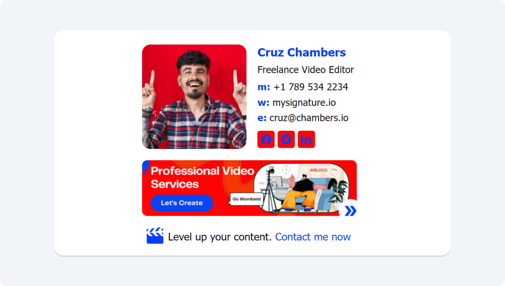
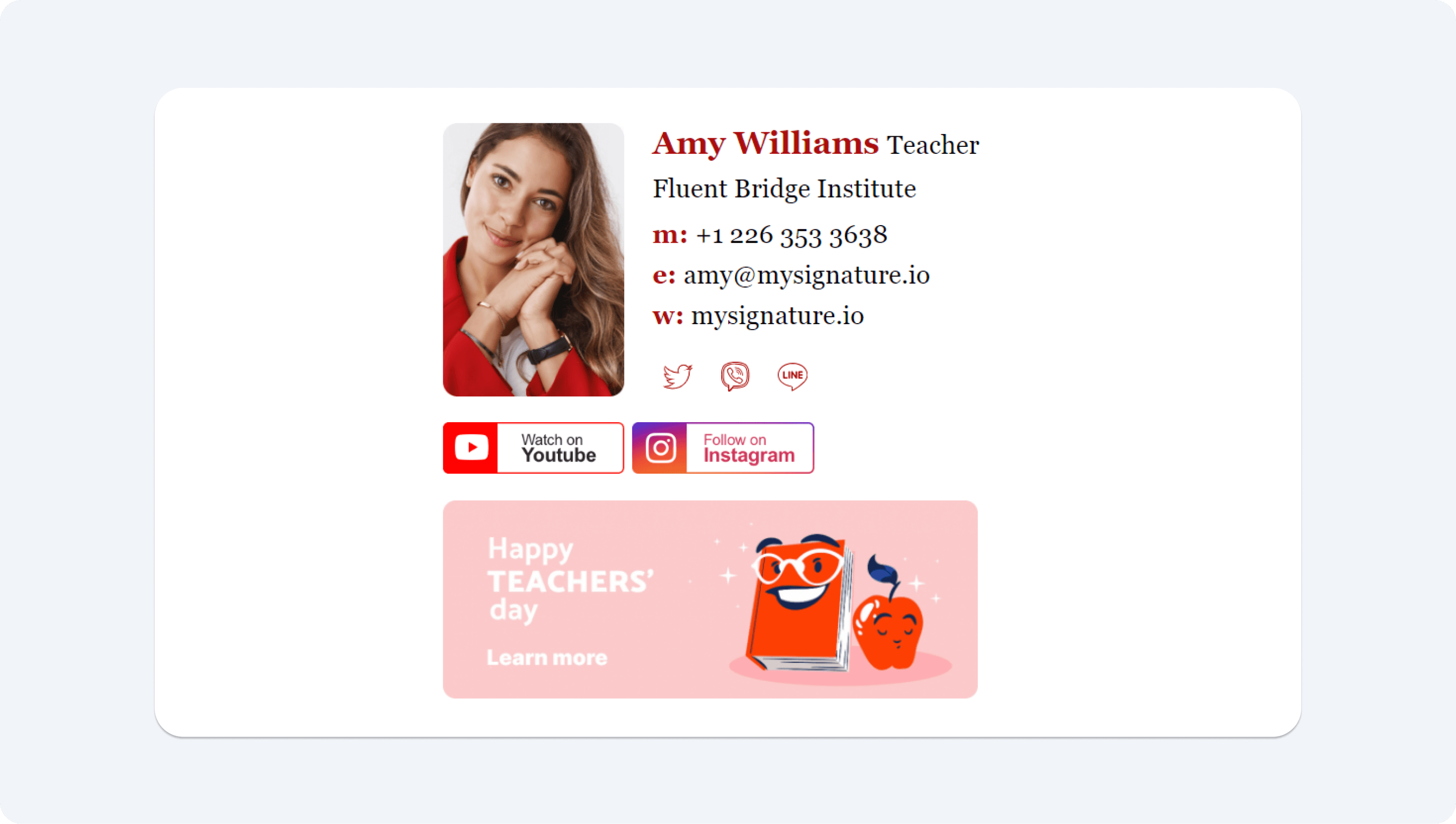
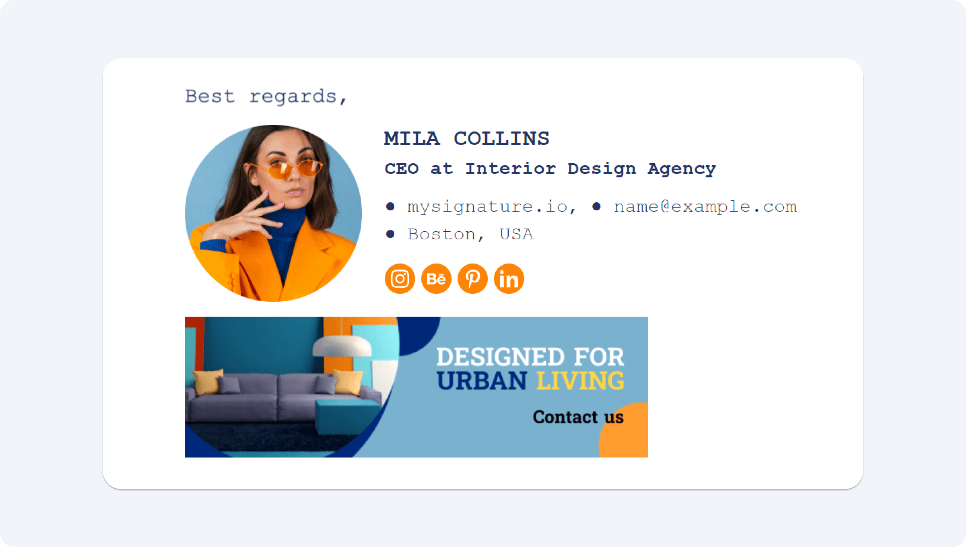
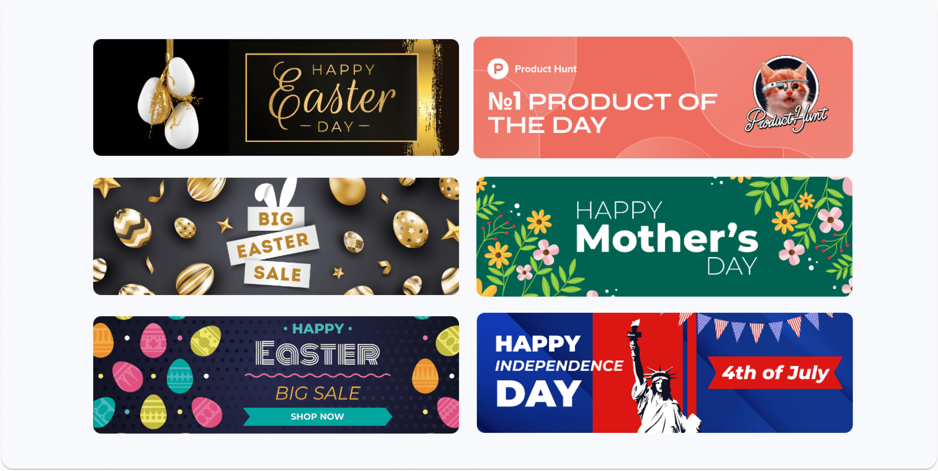
To give you some inspiration, we’ve put together a collection of examples that showcase different designs and approaches. So, below you’ll find a variety of banner styles, each designed for different purposes — whether you’re promoting a sale, highlighting a new product, or simply adding a professional touch to your emails.
Note that all email signature banner examples are created using a dedicated service called MySignature. With its help, you can easily incorporate a promotional banner into your email footer block. Try it now and see for yourself that it is easy to create a beautiful email signature design and a variety of banners without coding and design skills.

The benefits of adding a banner to your signature
Let us stress out one more time: adding a visual element like an appealing email banner to your signature can significantly enhance your communication. A well-designed banner doesn’t just make your emails look more professional — it motivates recipients to click and learn more about your business or services. Still not convinced?
Here’s how a thoughtfully crafted banner can benefit you:
- It promotes your business: Banners provide fresh content and information about your business, whether it’s a special offer, new white paper, product launch, or a key service you offer.
- It boosts engagement: Emails with banners can get up to five times more clicks than plain-text messages, increasing the likelihood of a purchasing decision.
- It keeps customers informed: Use banners to effortlessly update your regular customers on exclusive discounts, sales, or changes in your pricing policy.
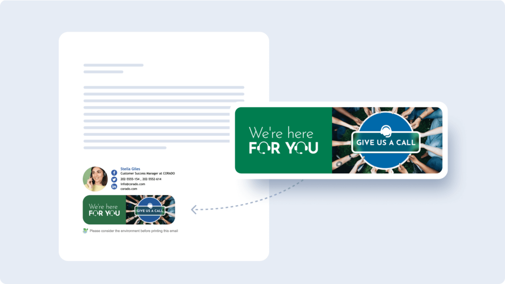
- It enhances professionalism: A banner adds a polished touch to your signature, making your communications stand out with an excellent finish. Plus, it reflects your company culture, showing that your business values attention to detail and presents a cohesive brand image.
- It evokes positive emotions: Beautiful images can evoke positive emotions, making your emails more memorable and engaging. Use an email signature banner creator to design stunning visuals that resonate with your audience and leave a lasting impression.
- It showcases creativity: For creative professionals like designers or decorators, an email banner is a perfect way to showcase your creativity and experience. However, it’s essential to consider your audience’s preferences. For instance, lawyers or accountants might opt for a simple, elegant banner with minimal graphics, avoiding overly fresh colors or images.
Being a designer, an artist or a decorator, you can showcase your creativity, experience and talent, selecting and customizing an impressive email banner design. Meanwhile, remember about your professional peculiarities and your targeted audience tastes and preferences. Thus, a lawyers or accountant would rather need a simple promotional banner that includes only graphical elements. Fresh colors and pictures are usually not recommended for use in this kind of messages.
How Does a Successful Banners Ad Look Like?
An email signature banner isn’t a one-size-fits-all solution for your marketing needs, but when done right, it can be incredibly effective. To create an email signature banner to promote your business, consider the key elements below.
Your banner ad must be:
- Sincere and personalized: A successful banner feels genuine and speaks directly to your audience. Tailor it to reflect the personality of your brand and make it relevant to the recipients.
- Simple and focused: Keep your banner image clean and uncluttered. A simple design is often more effective, ensuring your message doesn’t get lost in a busy layout.
- Targeted for the audience: Consider the demographics of your potential clients — gender, location, age, and more. A well-crafted email signature marketing banner should speak to the specific needs and interests of your audience.
- Includes a clear call to action: Encourage engagement with a strong call to action button. Whether it’s “Learn More,” “Shop Now,” or “Get Started,” make sure the next step is clear and easy to follow.
- Problem-solving: Your banner should address a pain point or offer a solution that resonates with your audience, making your marketing message more compelling.
- Visually professional: Use high-quality, eye-catching designs that reflect the professionalism of your brand. The banner image should be around 600 x 200 pixels for most emails, but for Outlook messages, 100 pixels in height is often preferred due to display differences.
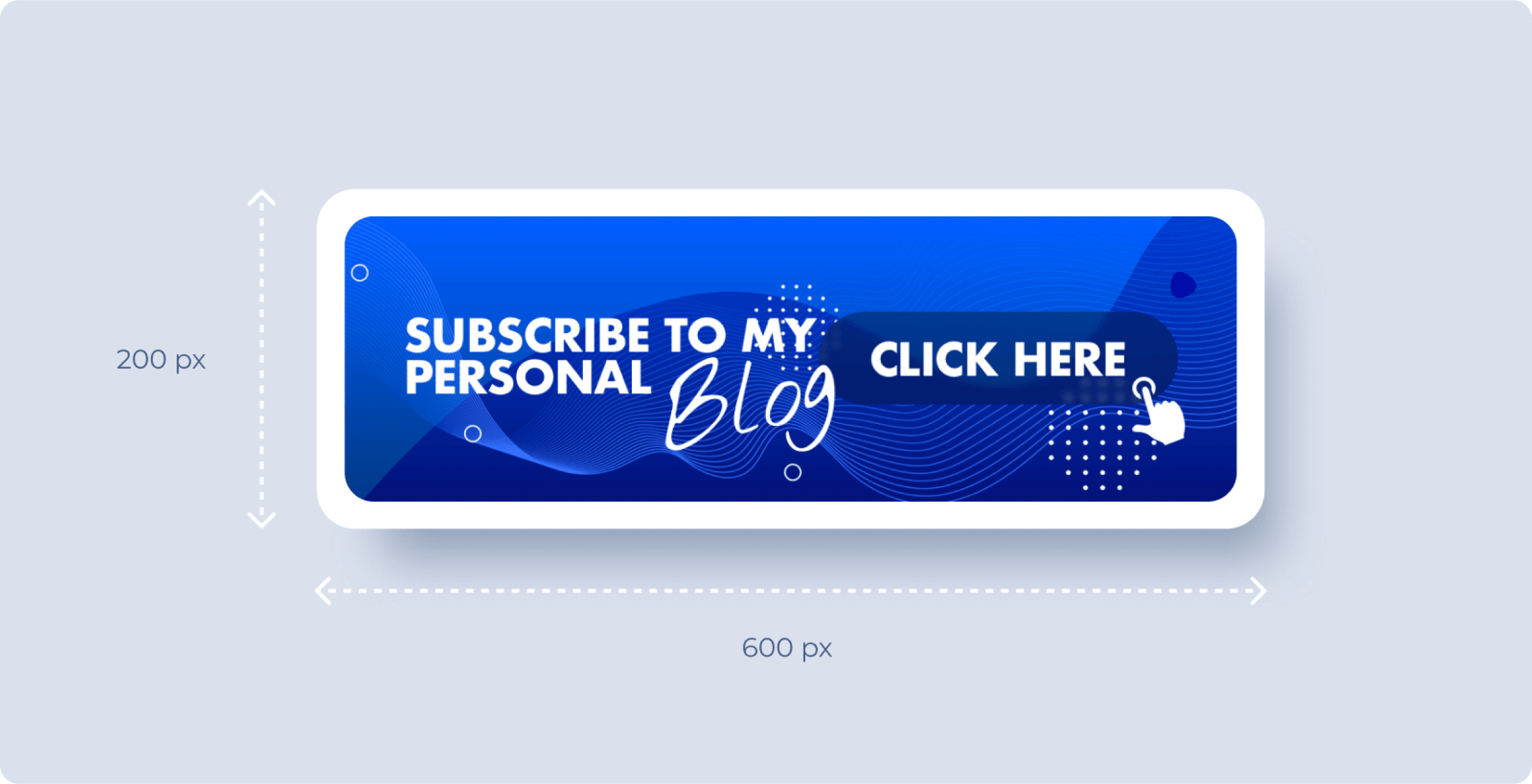
Avoid heavy or cluttered designs, as these can have the opposite effect, making your email look unprofessional. Remember, the goal is to create a visually appealing email marketing banner that enhances your everyday emails without overwhelming them.
Promotional banners work best when they are inspired and thoughtfully crafted. The right mix of colors, lines, images, and creative design can turn a simple email footer into a powerful marketing tool that resonates with your audience and drives action.
How to Add Email Banner to Your Email Signature?
Let us finally show you how to add a banner to your email signature and make your messages truly stand out.
1. Choose a reliable online tool: Start by visiting a website that offers a powerful email signature banner maker. For example, MySignature email signature generator. Try it to see how easy the entire process can be.
2. Select a template: Pick a template that fits your business and audience. The mySignature gallery offers dozens of professionally-designed banners for various occasions.
3. Customize the template: Personalize the banner with your header, subheader, and any other details.
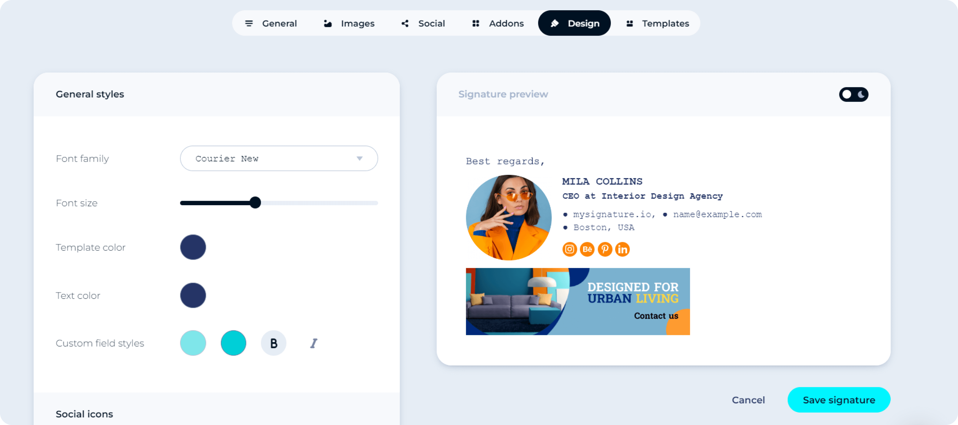
4. Add your logo or photo: Upload your logo or a personal photo to make your banner more recognizable.
5. Include your contact information: Add your contact details to ensure recipients know how to reach you.
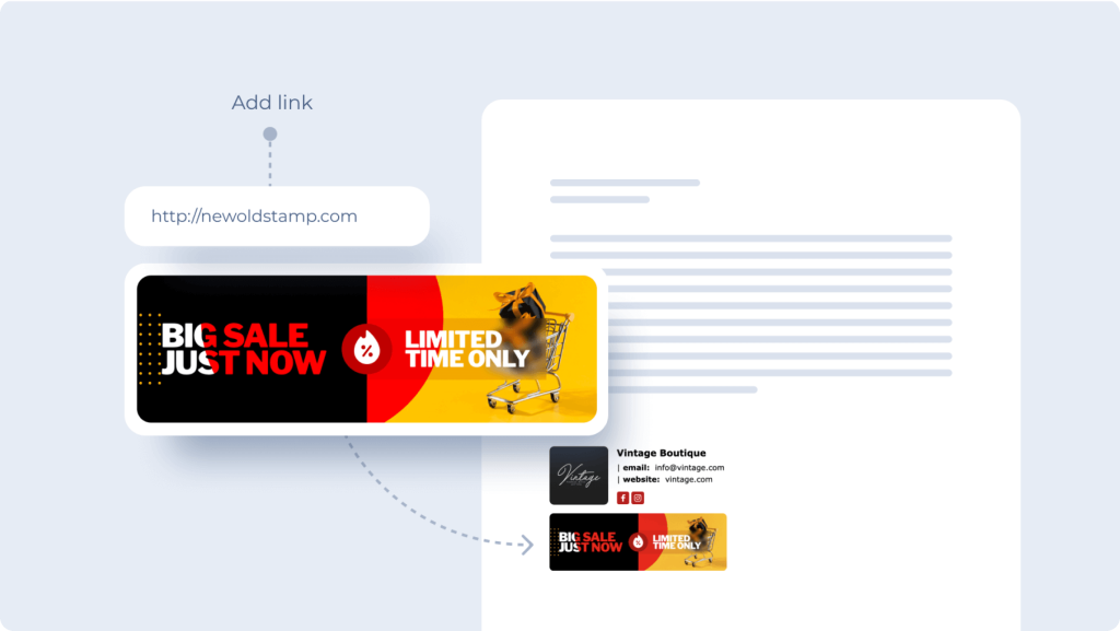
6. Copy and paste the banner: Copy the image URL and paste it into your email platform’s signature settings.
7. Test your banner: Send a test email to yourself to make sure everything looks perfect.
By following these steps, you’ll have a professional email signature with a stunning banner that grabs attention.
Tips for Successful Banner Email Signature Marketing Campaign
As we near the end of our article, we’d like to share a few more valuable tips with you.
To elevate your email signature banner campaign, consider these unique strategies:
- Integrate with broader campaigns: Align your banner with your overall marketing strategy. Use it to reinforce messages from your social media, website, or other promotional efforts. This is an excellent opportunity to create a cohesive brand message.
- A/B test your banners: Experiment with different email signature banner templates to see which one resonates best with your audience. A/B testing can reveal what designs and messages drive the most engagement and help you optimize your collection of email signatures.
- Leverage seasonal themes: Update your custom email signature banner to reflect holidays, seasons, or special events. For example, switch between a Valentine email signature, an Easter email signature, or a 4th July email signature to keep your emails fresh, timely, and more engaging for recipients.
- Incorporate interactive elements: Where possible, add clickable elements like buttons or links directly in your banner to guide recipients toward your call to action, making the most of their engagement.
- Analyze performance metrics: Regularly review the performance of your email signature banners. Pay attention to click-through rates, conversions, and reader feedback to continuously improve your approach.
By applying these advanced marketing practices, you’ll create a more dynamic and engaging email signature banner campaign that not only captures attention but also drives measurable results.
To Sum It All Up
Want to make your emails more impactful? Adding a banner to your signature can help you grab attention and boost engagement. With its rich customization options, MySignature makes it easy to design and implement the perfect banner for your needs. Give this advanced email signature management software a try and start seeing better results from your email marketing efforts.
