
Last Updated on 08.10.2026 by Danylo T
Dark mode is already a trend of the user interface, becoming more and more popular each year. Today, dark mode is available for most devices and software applications, including popular email clients (Gmail, Outlook, Apple Mail).
What Is dark mode and how does it affect email signatures?
Dark mode is an interface mode that inverts colors on your devices to reduce the screen brightness. So, it changes a white background and black text to a black background and white text. The main benefit of the dark mode is easing your eyes’ strain, especially at night time.
In general, dark mode doesn’t influence email template designs, and all emails look good on both interface settings.
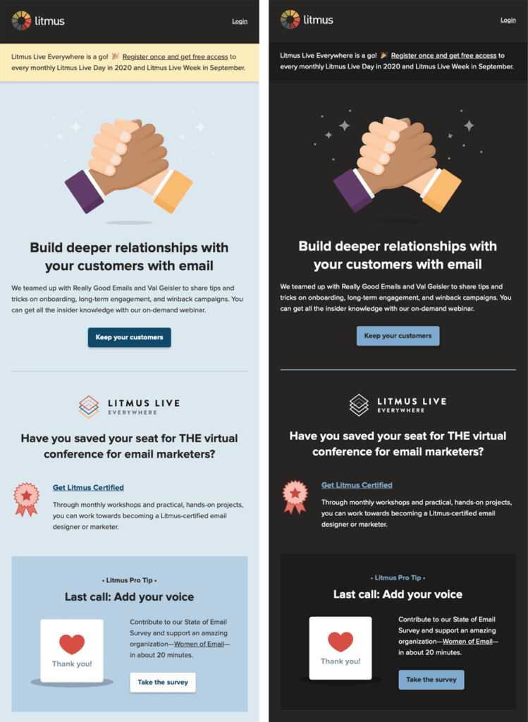
Source: Litmus
However, there may appear some issues with all email elements in dark mode. In this article, we will cover all the problems related to email signatures. It is one of the most valuable parts of the email template, so let’s find out what to do when your email signature doesn’t work properly in a dark mode.
Why email signatures break in dark mode
Dark mode settings change the color of an interface, and many people see their emails with a dark grey background and white text. So it means that it is better to remove any dark elements from your email signature. Because if you don’t do this, it may cause unforeseen issues with your signature design.
Here is a list of things that can happen with an email signature in dark mode:
- Black or grey text or links are reversed to white color to look better on a dark background.
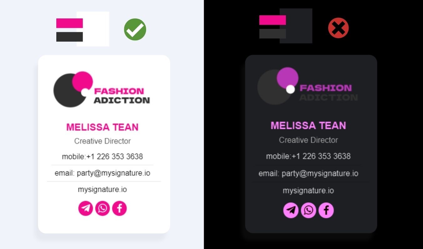
- The email client can invert other text colors to appear suitable on a dark background. For example, a dark blue might be changed to green. It might affect your company logo, even if you use a few simple colors.
- Transparent Logos (especially with any dark elements) can get lost in the background.
- Images added with a white background will have a white box around them.
- Background colors also may be inverted by the email client.
A quick way to reduce this risk is to build the signature with this checklist:
- Use an HTML structure instead of turning the entire signature into one flat image.
- Use transparent PNG logos that work on both light and dark backgrounds.
- Don’t rely on background colors to make important elements visible.
- Avoid pure black and pure white where possible, as they are more likely to be inverted.
- Test your signature in major email clients, including Gmail, Outlook, and Apple Mail.
- Keep the layout simple, clean, and readable even when colors change.
How to make an email signature dark mode-friendly
There is no fast solution to fix all issues. However, you can minimize and optimize your signature for dark mode. If you see that your email signature has some issues in dark mode, here is the best list of recommended tips you can use to make signatures meet your needs and look perfect.
Create email signatures using professional tools
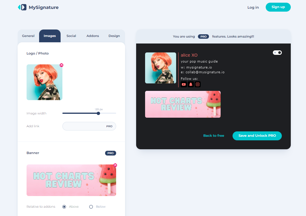
First of all, create your email signatures using dedicated email signature generators. For example, platforms like MySignature allow you to get a professional HTML email signature. Moreover, there is a switching button in the editor to dark mode. So you can see how your sign will look in dark mode directly in the editor, or check how your signature looks in both: light and dark ones.
What are best image formats for dark mode email signatures
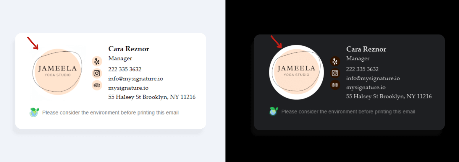
If you use images with background, make sure it is transparent. An image that looks good on a white background might look inappropriate in dark mode. Transparent background can help you avoid white frames around your images by taking the color from the HTML/CSS.
How to choose dark-mode-safe logos, icons, and signature elements
The main problem in dark mode is when a photo or logo has black or dark text because those elements of the logo can be lost in the dark background. If you can, choose a version of your logo that uses specific colors that would work on both backgrounds: white and dark. In other cases, consider adding a white stroke or glow around dark elements.

This white stroke creates a visible white background that makes dark letters more legible in a dark mode. You can use Photoshop, Canva, or similar editors to do it fast and with no struggle.
The same approach applies to social media icons and dividers: use colors that remain visible on both light and dark backgrounds, and avoid very thin or low-contrast elements.
For banners, avoid designs where important text blends into the background if colors are inverted.
Headshots and other photos usually work better with a defined background or subtle border so their edges remain clear in both light and dark mode.
Choose best text colors for dark mode
Dark mode settings may convert all your signature colors to different ones. So, your branding style may be violated because of these changes. Try to avoid pure white in your text color. It is better to use not-so-bright and not too dark colors to make your text look readable. Also, some email clients invert colors based on their contrast ratio, so you can use the Contrast Ratio tool to find out how it will look.

How different email clients handle dark mode
Even if you choose safe text colors, your signature may still lose consistency in Gmail, Outlook, and Apple Mail. It happens because each email client uses its own dark mode rules, so one design can be inverted fully, partly changed, or left almost the same. That is why you should not rely on one preview only.
Dark mode issues in Gmail
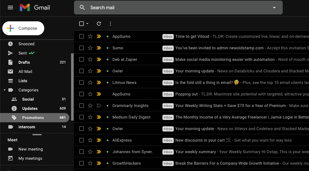
Gmail is one of these email clients where your signature can change differently depending on the app. In general, it may invert text and link colors, while some backgrounds stay light, so your logo or icons can look separated from the rest of the signature.
- Check your signature in Gmail on desktop and mobile, because rendering may be different.
- Avoid dark transparent logos, because they can disappear on a dark grey background.
- Use simple background colors or no background, so Gmail has fewer elements to change.
- Send a test email to Gmail separately before using your signature.
Dark mode issues in Outlook
However, Outlook can be even more unpredictable, because it may read HTML and CSS in its own way. So, your signature colors, images, and background blocks can render differently, especially when dark mode tries to improve contrast for a darker background.
- Keep your HTML simple, because complex CSS may not work correctly.
- Avoid dark transparent logos, so your brand elements stay visible.
- Use safe background colors, or remove them if they invert badly.
- Test your signature in Outlook before using it.
Dark mode issues in Apple Mail
After Outlook, Apple Mail usually looks more stable in dark mode, because it keeps many HTML colors closer to the original design. However, you should still check your signature carefully, as dark logos, transparent images, and low-contrast text can disappear on a dark background.
- Test your logo on both backgrounds, so dark parts stay visible.
- Use transparent images, but add a light stroke if needed.
- Check text contrast, because grey colors may look too soft.
- Send a test email to Apple Mail before using your signature.
Common mistakes to avoid
Even if your email client keeps your signature stable, you should avoid choices that need one perfect background. So check risky parts before you use your signature every day.
| Mistake | Risk | How to avoid |
|---|---|---|
| Starting with a logo that only works on white | Dark parts may disappear. | Use a stroked or balanced version. |
| Using one flat image for the whole signature | Your text cannot adapt in dark mode. | Keep text as HTML, images separate. |
| Relying on background fills | Gmail or Outlook may invert them. | Use simple blocks and transparency. |
| Using tiny gray text and skipping mobile dark mode tests | Low contrast gets worse on small screens. | Choose readable sizes and test mobile. |
| Copying builder code without verification | Extra styles may render differently. | Test in Gmail, Outlook, Apple Mail, or Litmus. |
| Forcing branding colors or placing a product CTA first | Your signature may look branded but not helpful. | Fix readability, then add a useful CTA. |
How to test your email signature in dark mode
When you prepare your email signature, make sure you have tested it in both modes to see how it looks.
Just send two emails to yourself as the recipient and check if it works and looks great.
Open the email in Gmail, Outlook, and Apple Mail on desktop first. Check the signature in light mode, then switch to dark mode and check it again.

Then test the same email on mobile. Open it in the Gmail app, the Outlook app, and Apple Mail on iPhone or iPad if you use them.
Check it on different operating systems too. Test desktop versions on Windows and macOS, and mobile versions on iOS and Android, because the same signature can look different across devices.
Also, you can use testing tools. For example, Litmus can show you the screenshots of your emails across different email clients, and the dark mode option is also included.
Dark mode email signature checklist: do’s and don’ts
After you check screenshots in Litmus, still use a short checklist, because your signature can change after forwarding, replying, or opening on mobile. So, before you publish it, compare the main do’s and don’ts below.
| Do | Avoid |
|---|---|
| Use transparent PNGs for your logo and icons | White background logos that create a visible box |
| Keep your text readable with safe contrast | Tiny or low-contrast text that disappears |
| Simplify your layout and background areas | Relying on background fills to hold design |
| Test your signature in Gmail, Outlook, and Apple Mail | Assuming one email client equals all clients |
| Host images correctly and review mobile rendering | One-image signatures or publishing without testing |
Conclusion
So, by working on small changes for your email signature, you can avoid any issues in dark mode on all email clients and devices. The essential things you should cover to be safe are:
- Use professional tools for signature creating
- Add transparent background images only
- Work with your font and images colors that may be inverted
- Always test email signature before sending
Using all these tips, you can be sure that your email signature design is fully optimized and ready to use in dark mode.
FAQ
Why does my logo disappear in dark mode?
It usually happens because your logo does not have enough contrast. If it has transparent areas or dark letters, Gmail, Outlook, or Apple Mail can place them on a dark background, so your logo blends into your signature.
Does Gmail change signature colors in dark mode?
The same thing can happen with your text and links. Gmail may adjust some colors in dark mode, however, it depends on the device and app you use, so your signature should be tested in Gmail before you use it every day.
Should I use a background color in my signature?
If Gmail changes your colors, a soft background can help your text stay readable. However, some email clients may invert or ignore this color, so your signature can get an unexpected block or contrast problem. In general, use a simple, light shade and test it in both modes.
How do I test my signature in dark mode?
That is why you should test it before using it every day. Send a few emails to yourself, because replies and devices may show your signature differently.
- Check Gmail, Outlook, and Apple Mail.
- Open it on mobile and desktop.
- Compare both light and dark modes.
What is the best logo format for a dark mode email signature?
After testing, look at your logo file first, because low-quality images and dark details can disappear when the background changes. In general, use a high-quality PNG, or SVG where email clients support it, so edges stay clean.
- Keep enough contrast.
- Add safe spacing around your logo.
- Avoid tiny dark text inside the image.