
Last Updated on 21.07.2026 by Vasyl Holiney
Open the inbox of an average mid-level manager and scroll to the bottom. What you’ll sometimes find there resembles a NASCAR jacket. Corporate badges, a row of social media icons, a link to a calendar, a QR code, and a “Top 40 Under 40” award from a few years ago. Of course, this design grabs attention. But often it simply shows that the profile owner doesn’t have as much attention as they’d like.
So we became curious about what things are like at the opposite end of the spectrum. What do the key figures in the tech industry actually include under their names? We reviewed the profiles of over 1000 tech company founders, venture capitalists, and top executives who create their signatures on MySignature, then began tallying which email signature elements they use most frequently.
The pattern was almost boring in its consistency: where one might expect a display of status, there was almost complete silence. The point is simple – once you reach a certain level, a concise signature outperforms an overloaded one. Below are the results of the analysis and why.
Key Takeaways:
👉 The most common CEO signature is surprisingly minimal, with every element serving a clear purpose.
👉 A professional headshot builds more trust than a company logo for most executives.
👉One or two carefully chosen links create more credibility than a long list of social profiles.
👉 Most CEOs avoid banners and promotional content unless it supports a major business objective.
👉 The easiest way to improve a signature is often by removing unnecessary elements, not adding new ones.
What 1000+ CEO Signatures Actually Contain
Before delving into the analysis, let’s first take a look at the collected email signatures as a whole. If you line them all up, a certain pattern becomes evident. Their design is the result of a series of decisions about which elements deserve a place in the signature and which are best omitted.
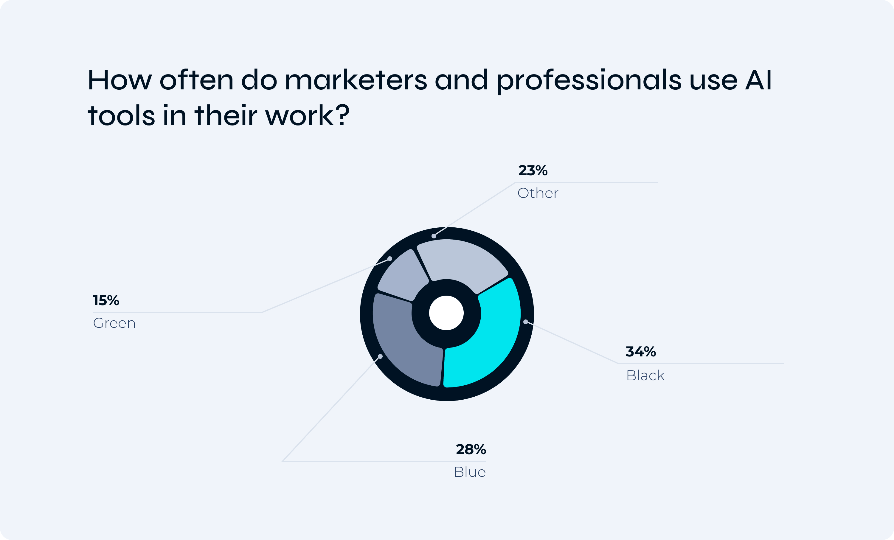
The Palette of Restraint (34% Black, 28% Blue, 15% Green)
A little over a third go plain black-on-white and stop there. When color does show up, it is the cautious, institutional kind: blue for trust, green for growth. Nobody is reaching for orange or hot pink. A signature should express calmness, and calmness is rarely found in neon colors.
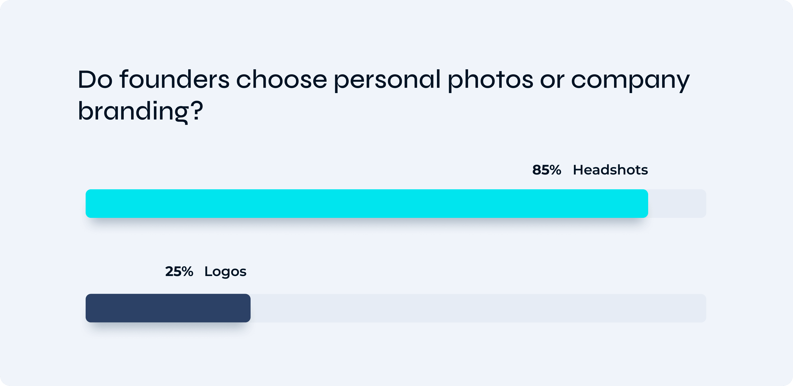
The Human Connection (85% Headshots vs. 25% Logos)
Around 85% use a real headshot, while only a quarter bother with the company logo. At this level, people choose the person, not the entity. The founder is the brand, not the logo. And roughly one in six drop images, which is perceived as a display of status and confidence.
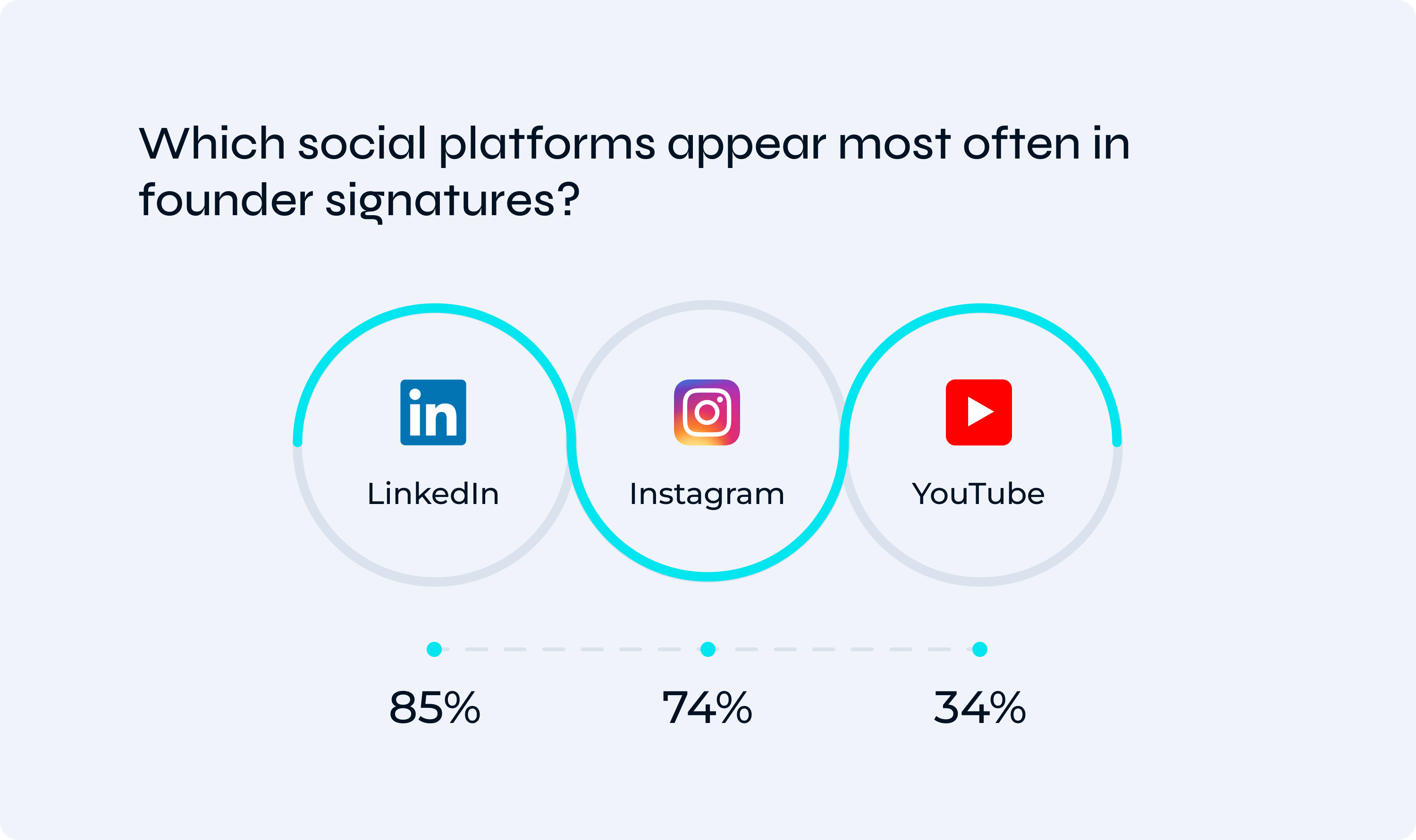
Curated Reach (85% LinkedIn, 74% Instagram, 34% YouTube)
No one dumps every profile they have ever opened. Most settle on two, occasionally three. LinkedIn is the constant, the resume that never clocks off. But the strong Instagram and YouTube numbers point to something newer: founders now use visual platforms to tell their own story instead of handing that job to a comms team. WhatsApp keeps showing up as the direct line, too, which suggests these folks would rather just get the message than book a call to plan one.
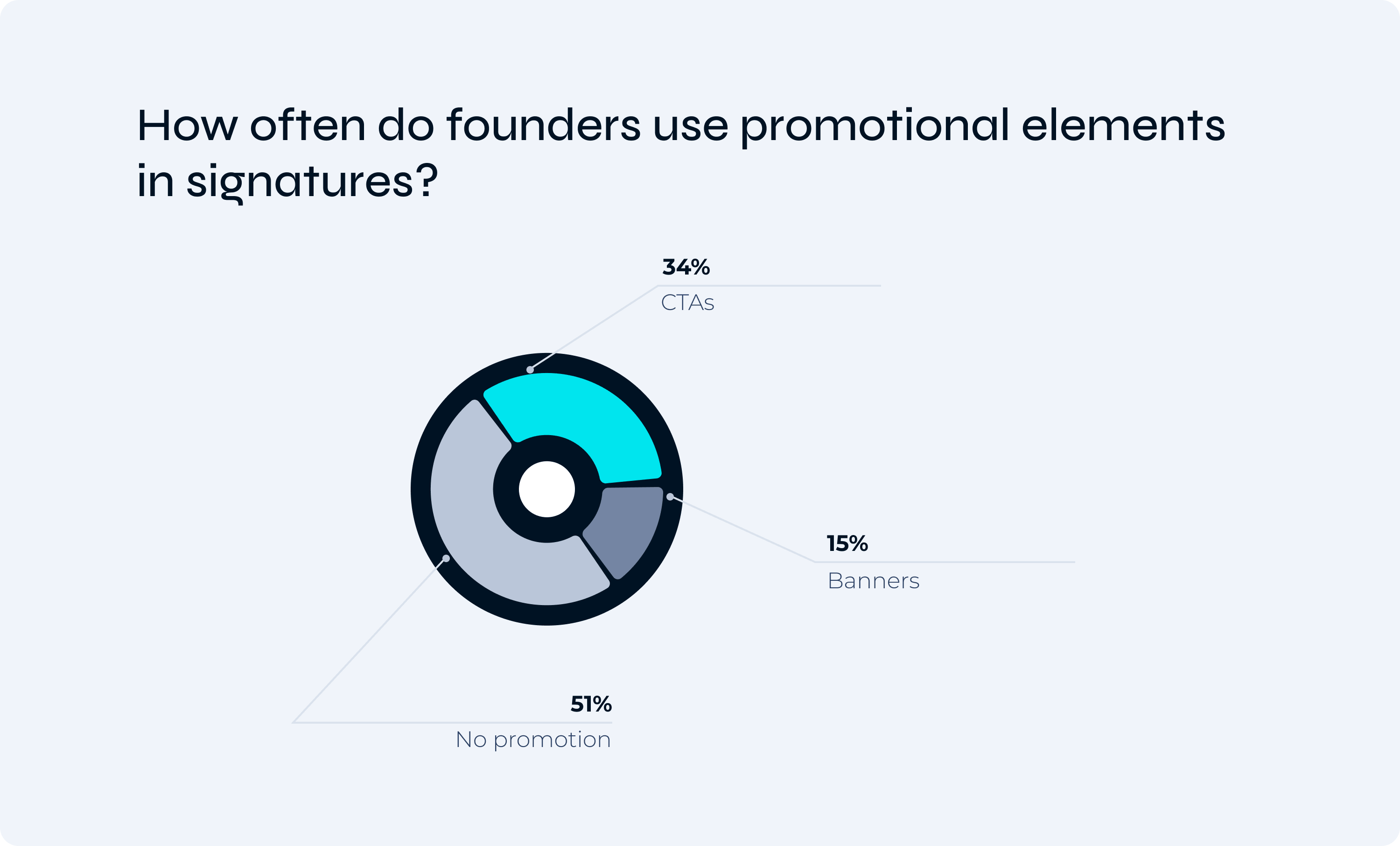
The Rejection of Over-Promotion (15% Banners vs. 34% CTAs)
Just 15% run a promo banner beneath the signature. That number is tiny on purpose. A CEO sign-off is not ad space. When a call to action does appear, roughly a third of the time it points to something that genuinely matters: an investor page, a major press hit, a funding milestone. You will not catch a “Buy now” down there.
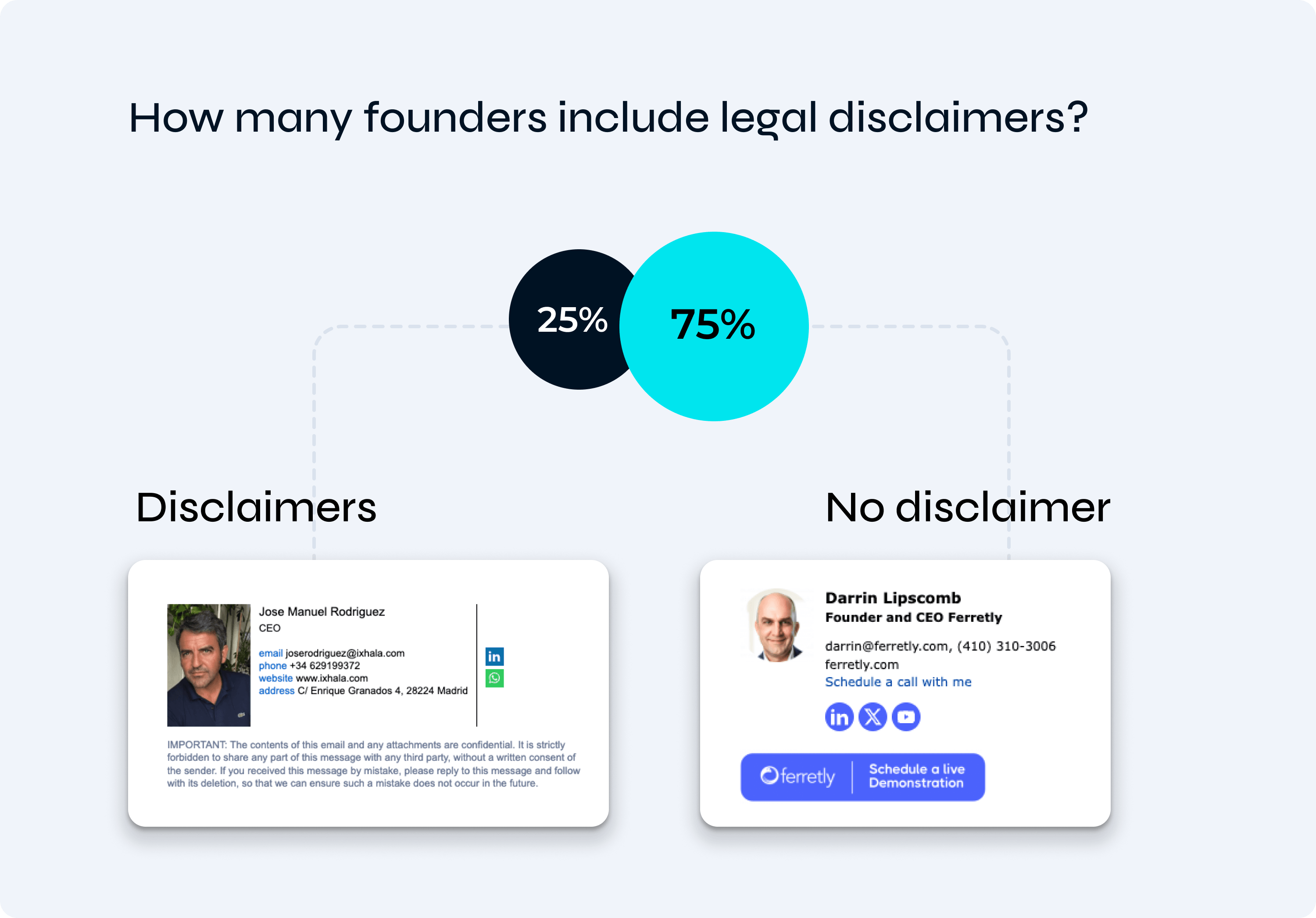
The Compliance Baseline (25% Disclaimers)
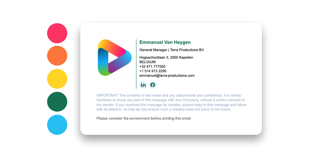
Exactly a quarter carry a legal disclaimer, and most of those sit in finance or healthcare where compliance leaves no choice. Everybody else strips it out. The logic is blunt: if a line does not protect the company, it does not get to take up room.
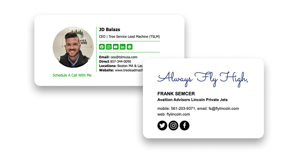
Review all five examples carefully, and you’ll see that they share a common thread – subtraction. These characteristics are defined not so much by what made it into the final version as by everything that was left out. Remember that every element must serve a specific function, not just grab attention. If you’re curious how these patterns compare with broader business trends, explore our email signature statistics.
Why CEOs Keep Their Signatures Almost Empty
Numbers provide only a limited picture. A more pertinent question is why these signatures are so minimalist. And the answer has less to do with personal taste than with how power typically manifests itself. Minimalism here is no accident. That is the whole point. To be fair, an overloaded signature isn’t necessarily a bad thing.
It all depends on the objective. It would be strange for a sales representative to omit an “Order a Demo” button. A support manager must include a link to the help center, since that’s simply a service for the customer. But a CEO plays a different game with different rules. Designer Paul Rand succinctly put it this way: “Design is the silent ambassador of your brand.”
Your signature is like a handshake you give thousands of times a week without even thinking about it. And take note of what luxury brands never do. A Chanel storefront isn’t plastered with neon “50% Off” stickers. Restraint – that’s where the power lies. If your sales team’s signatures resemble a cluttered market stall, the CEO’s signature should evoke the feeling of being in a five-star hotel lobby.
Quiet, spacious, and nothing is being forced upon you. No one is chasing after you with a brochure. The space itself tells you that you’re in the right place. This brevity makes it clear that this person isn’t fishing for your attention. They already have it. And if you’re looking for practical guidance on what to keep and what to discard, we’ve covered this in detail in MySignature guide to creating an email signature for a CEO.
How a Smaller Signature Builds More Trust
Here’s something that might seem paradoxical until you get to the heart of the matter. Every element you remove makes what remains more compelling. Imagine that every unnecessary element is an extra burden on the reader. It forces them to stop, leave the email, and do things that interest them more.
Warren Buffett once said something that everyone quotes, and it applies here as well: “It takes 20 years to build a reputation, and five minutes to ruin it.” On the internet, reputation is built on consistency, predictability, and knowing when to stay silent. Say one thing too many, and the essence of your message gets lost.
That’s why when a CEO includes just a single link, a press release, or their assistant’s direct number, it makes a strong impression precisely because it happens so rarely. It is precisely this scarcity that gives it weight. People trust these links because there aren’t ten of them, and they aren’t all competing for the same click.
Ultimately, your signature is a small touch that reflects how you run the entire company. It’s the last thing an investor, partner, or client sees before closing the tab. Authority comes from your position and from the fact that you have something to say. It doesn’t depend on the number of lines listed under your name.
“The more senior you are, the less you need to prove. High-status minimalism isn’t a style choice; it is a display of confidence.” That is precisely why, in a successful company, the CEO usually has the shortest signature in the entire building. Strip away everything unnecessary, and only the person remains. That was the whole point.
What to Keep in a CEO Signature, and What to Cut
What should you keep in mind when creating an effective CEO email signature? Let’s summarize briefly. Be sure to include your full name and title – there’s no question about that. Include one high-quality portrait photo if you have a good one, because it inspires more trust than any logo. Include the company name and website address.
Choose one or at most two social media links, and make sure LinkedIn is among them. If there’s a quick way to contact you or your assistant directly, that’s better than any button you might add. Then start deleting. You can remove the inspirational quote. The same goes for the second phone number, the fax number that somehow survived into this decade, the whole wall of five social media icons, and the banner still advertising last quarter’s webinar.
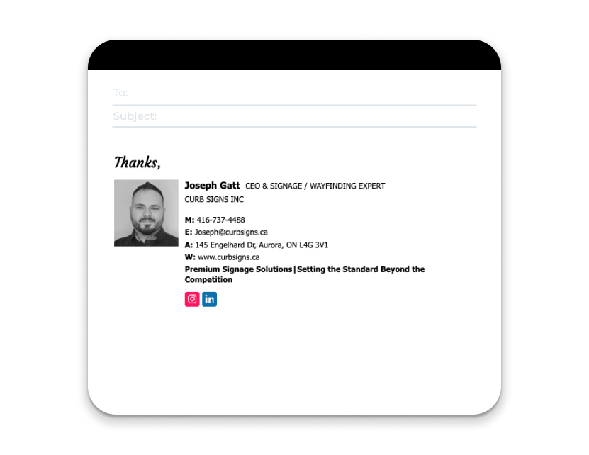
Unless you work in a regulated industry, the legal disclaimer can probably be removed as well. And here’s a good test: read the byline aloud. Anything that makes you feel the need to provide extra explanation is a line worth deleting.
The Mistakes That Make a Signature Look Junior
Email signatures that are too obviously intended to make an impression tend to repeat a few typical mistakes. The most serious of these is using the caption as an advertising billboard, as we mentioned at the very beginning. This comes across as insecurity masquerading as authority.
Close behind are: fonts and colors that clash with the brand; images that fail to load and turn into a sad red X in half the inboxes around the world; and links that quietly stopped working after a rebrand, without anyone noticing. Then there’s the classic: six social media icons doing the work of two. None of these elements on its own will ruin you. However, taken together, they send the same signal as a cluttered desk.
This person is busy pretending to be busy. And the solution is almost always the same: remove something. Do it right, and no one will consciously notice a thing. People will simply walk away thinking that the person on the other end has everything under control. And that, when you think about it, is the only purpose a signature has ever served.