

Email signatures have come a long way. But even though HTML email signatures offer a range of customization options, you need to ensure that every element works together as part of your brand.
And just as color schemes, branding elements, images, and banners, email signature fonts are vital if the signature is going to look good, be easy to read, and be consistent with your brand.
In this comprehensive guide, you'll discover the different font types, factors to consider when choosing a font, the best font for email signatures, and design tips for ensuring your font choice works well with the overall design.
Understanding font types
The first step in making informed choices of fonts in email signatures is understanding their types. Here are the three main ones:
Serif Fonts
Serif fonts are the oldest type of font used today. The word "serif" actually means a stroke that finishes off a letter, and it supposedly evolved because the brushes used by scribes would leave small marks after each stroke, embellishing the letter.
Today, serif typeface can be distinguished by the "feet" at the bottom or end of a letter. Some of the most popular serif fonts include Times New Roman, Georgia, Garamond, and Merriweather.

Serif fonts are a classic choice that's great for a variety of uses. They are prevalent in print media, such as books and newspapers. They can also be a good font for signature design if you want an authoritative and professional look, which can work well in a B2B setting.
Sans-Serif fonts
Sans in sans-serif means "without," which provides a clear clue about how it differs from serif. Sans-serif fonts don't have serifs, the decorative lines extending from the letter's end.
It's a cleaner, sleeker design that makes it very effective on the web, especially in headlines and short blocks of text. The versatility of designs and the simple and uncluttered look are just a few reasons for its popularity.

When sans-serif fonts were first introduced a century ago, they were met with a lot of resistance and were even called ugly. But after they have been adopted by forward-thinking art and design movements such as the Bauhaus, they became associated with modernity and the cutting edge. Today, the minimalist look remains highly relevant and might be the best font for signatures in most situations.
Handwritten fonts
As the name implies, fonts that look like handwriting are designed to resemble letters written by hand. These fancy fonts may not be the most practical to use in digital formats, but they have their purpose when you want to add a personal touch to an email signature.
As part of a unified design, handwritten fonts can create a more casual look that seems less formal, which can be useful for personal brands. Another popular use for handwritten fonts is the signoff, which can seem more authentic when it looks like a real signature.
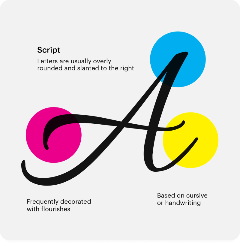
When choosing a handwritten font, make sure it's clear, easy to read, and matches the rest of your signature. You should also be careful not to use too many different fonts in your design, as that can result in a cluttered and distracting look.
Factors to consider when choosing a font for a signature
When selecting the best fonts for email signatures, you need to be mindful of factors that will determine whether the font will enhance or limit your signature's effectiveness. Here are a few key things to consider.
Choose web-safe fonts for cross-device compatibility
Your font in your email signature will only work if it displays correctly across devices and browsers. And since your signatures will be viewed online, you want to ensure that you use web-safe fonts and that they won't get distorted or displayed incorrectly.
Some of the best email-safe fonts include Helvetica, Arial, Verdana, Georgia, Baskerville, Courier, Lucida, Monaco, Impact, and Palatino.
Match fonts with your brand identity
An email signature is an extension of your brand. So, you need to make it consistent with the brand identity you have created for your business. The effective signature will often be the first introduction to your brand, so it will set expectations and must be aligned with your website and overall web presence.
A simple way to ensure this is to choose fonts that are the same or at least similar to the ones used in your logo, website, and marketing materials.
Prioritize readability
It's crucial to ensure that the font you choose for your email signature is easy to read, even in smaller sizes. Even fonts that may look good initially may have too many decorative elements that hurt the readability of your signature once the font size gets smaller. It may seem like you chose the wrong email signature font.
It's also crucial to consider whether the font won't become a distraction. The best fonts seamlessly blend with the overall email signature design and are easy to read without drawing unnecessary attention to its elements.
Best Fonts for Email Signatures
Fonts come in all shapes and sizes. But sometimes, you just need a proven and safe font choice that will work well in your situation. To help you find the right option, let's look at a few fonts that suit different goals.
Classic and professional fonts
Classic fonts are all about positioning yourself as a professional. They're very popular with newspapers, books, and academia. If that's the way you want to position yourself, you can't go with these fonts:
Arial. Although it's a sans-serif font, it has a classic look, making it a great choice for a corporate email signature when you want to look professional and ensure your signature is easy to read.
Georgia. Developed in 1993 by Microsoft, Georgia is a web-safe serif font that has become a classic. It's a serif font with strokes that embellish it, but they are very subtle for a business email signature.

Times New Roman. Times New Roman might be the most classic font still widely used today, even though it's almost a century old. It was designed for newspapers but can work really well when you want a font that's clear and easy to read.

Modern fonts
Modern fonts are clean, sleek, and ideally suited for websites, email signatures, and social media. Here are a few good options to consider:
Tahoma. The Tahoma font is often viewed as an excellent alternative to Arial, but it's actually a modern and friendly-looking font that's a perfect choice for brands that want to seem more progressive.

Trebuchet MS. Trebuchet has a narrower letterform, which makes it not only modern and sleek but also a good font to fit more text.

Verdana was designed to make reading on a computer screen (or mobile phone) easy. It's great if you're using smaller font sizes and need to fit more information into your signature.

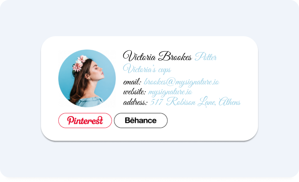
Elegant handwritten fonts
Using handwritten fonts can be a risky choice because of potential readability issues. It can work well in certain situations, helping your email signature stand out and reflect your unique personal brand. Many good email signature fonts have soft curves that can impart a friendly and approachable vibe to your email signature. Here are a few handwritten fonts you could consider:
Allura. Allura is a gorgeous handwritten font that is very popular for invitations, stationery, and even logos. It can work very well for a more personal signoff in your email signature as well.

Courgette. Courgette is a warm and artsy popular font that is great for creatives. However, it doesn't work too well in smaller size or longer paragraphs, so use it for the signoff or other shorter elements in your signature.

Great Vibes. Great Vibes is another elegant handwritten font that can be a great signoff or even become the central part of your email signature. Use this font if you want to make it a central element of your design and make your email get a positive impression.
Design tips for email signatures
A good font for signature design must blend well with the overall design. And that requires you to understand not just how to utilize fonts in your signature text but also how to make them look good.
Let's explore a few of the best signature font design tips below.
Pair serif and sans-serif fonts
Serif fonts are more traditional. Sans serif fonts are more modern. Together, these two font types can create a balanced and eye-catching email signature that will help enhance your brand.
For best results, use a serif font for your name and title, and a sans serif font for the rest of your signature. That's because serif fonts can be more eye-catching, while sans serif fonts improve readability in the digital format.

Blend handwritten fonts with complementary styles
Handwritten fonts and their intricate details can look amazing. Some certain fonts are more suitable for corporate or professional settings, while monoline script fonts can add a touch of elegance to your email signature. But to use them effectively, be deliberate about pairing handwritten fonts with font styles that augment it and compensate for some of its shortcomings.

For example, you could pair a handwritten font with a sans serif font to create a lighter and more casual look, which may go well with the more intricate designs that many handwritten fonts have. It's a good idea to rely on the serif sans font for the more extensive sections, using the handwritten font to highlight your name or add a signoff.
With MySignature, you can even utilize your own handwriting, adding a handwritten signature using our built-in generator. The best font for signature design might be one you write yourself, adding a personal touch to make your signature seem more authentic.

Play with font colors
Choosing the best font for signatures is not just about the font itself. It's also about the colors you choose to help the fonts look great in the signature design.
In most cases, it's best to use just a couple of colors that contrast nicely with the signature's background. You could also use a slightly lighter shade for one font and a darker one for the other.
Use Bold, Italic, or Underline sparingly
Font formatting, such as Bold, Italic, or Underline should be used sparingly and carefully to avoid cluttering your signature. That will also help ensure that when they are used, they help highlight essential information or details you want the reader to notice immediately.
For example, using a font in bold style cab be used to enhance essential information. Italics help draw attention more gently, for example, when you want to emphasize a word in a sentence. Underlying works great for links or phrases you use to make a strong point.
Do's and Don'ts for email signature design
Choosing the right font is an integral part of email signature design. But there are other factors to consider if you want your email signature to represent your brand and achieve your goals.
Let's look at a few of the main do's and don'ts of email signature design.
Do's

- Keep it simple and professional. A good email signature conveys important information in a way that's simple and professional. Consider the information you want to include and keep the design elements to a minimum.
- Test readability on various devices. Keep in mind mobile devices. Your signature needs to remain consistent on all devices, screen sizes, and different email clients (at least major email providers). Test the readability on different devices before sending emails with your new signature.
Don'ts

- Don't overuse decorative fonts. Decorative points can be great for adding a touch of personality, but they can also hurt readability and look unprofessional. Limit the use of handwritten fonts for small pieces of text, such as your name, the logo, or the signoff.
- Don't mix too many styles. One of the biggest issues email signatures often have is including too many elements and styles simultaneously. Instead, pick a style you want to use and stick with it as a central emphasis to keep your email signature professional.
Step-by-step guide on customizing fonts in MySignature
MySignature, an email signature generator, gives you complete freedom when customizing every part of your email signature. And that includes the ability to choose from various fonts, making the template your own.
Here's a simple three-step process for customizing fonts:
- Log in and go to the Dashboard with your signatures.

- Select the signature you want to edit.

- Choose a design block in the menu above and enjoy text customization options like font family, font size, and color. You can also use the Signature Font Generator to quickly select a font for a signoff or your name and make your email signature in a trendy style.

Frequently asked questions
- What is the best font size for an email signature?
The best email signature font size is between 11pt and 13pt. However, you may want to make some sections bigger than others, which is when you can use fonts as large as 20pt.
- Can I use custom fonts in my email signature?
You can use custom fonts that are created for your company. However, while it can help you stand out, it may not appear correctly on external devices. Because of that, it's usually best to use web-safe fonts that will always display consistently.
- Should I use a colorful font in MySignature?
The main priority when choosing a font for your email signature is readability. Therefore, it's usually best to use black or dark gray fonts and avoid bright colors, unless you use a dark background.
- Do email signature fonts support alternate characters for a unique look?
Yes, some fonts offer alternate characters that can provide a distinctive appearance to your email signature. Experiment with these features for a personalized touch.
- Can I use both upper and lower-case characters in my email signature fonts?
Absolutely, mixing upper and lower-case characters is a common practice in email signatures. It can help create a balanced and visually appealing signature.
- Are Google Fonts a suitable choice for email signatures?
Google Fonts offers a wide selection of fonts that can be used in email signatures. However, ensure that the selected font is web-safe to guarantee consistent display.
Bottom line
Professional email signature design offers virtually endless opportunities to showcase your brand and capture your audience's attention. But signature fonts matter, so you need to be mindful of whether they enhance readability and work well with the image you're trying to create.
MySignature allows you to choose email signature templates from various professionally-designed ones with beautiful signature script fonts combinations. Get started with MySignature today!
